Jumpstart new projects and website redesigns with a few of the hottest elements in design for 2021. These trending styles are sure to help you create in a way that’ modern, fresh and perfect for the new year.
Here’s the best part: Many of these design elements can be mixed and matched with each other (and many other elements as well) to help you create something as unique and special as your projects.
Many of the trends that are emerging are extensions of things we predicted (and saw in 2020) – dark mode, breaking typography rules, artistic illustrations, color, layering, and more. Watch a video about 2021 web design trends:
Read more about previous trends:
Here are the top web design and user interface trends for 2021 (and beyond).
Online Email Template Builder
With Postcards you can create and edit email templates online without any coding skills! Includes more than 100 components to help you create custom emails templates faster than ever before.
Try FreeOther Products
Web Design and UI Trends to Follow in 2020
Dark Mode
Clement Merouani
Ballsystem
Golden Suisse
Peter Lindbergh
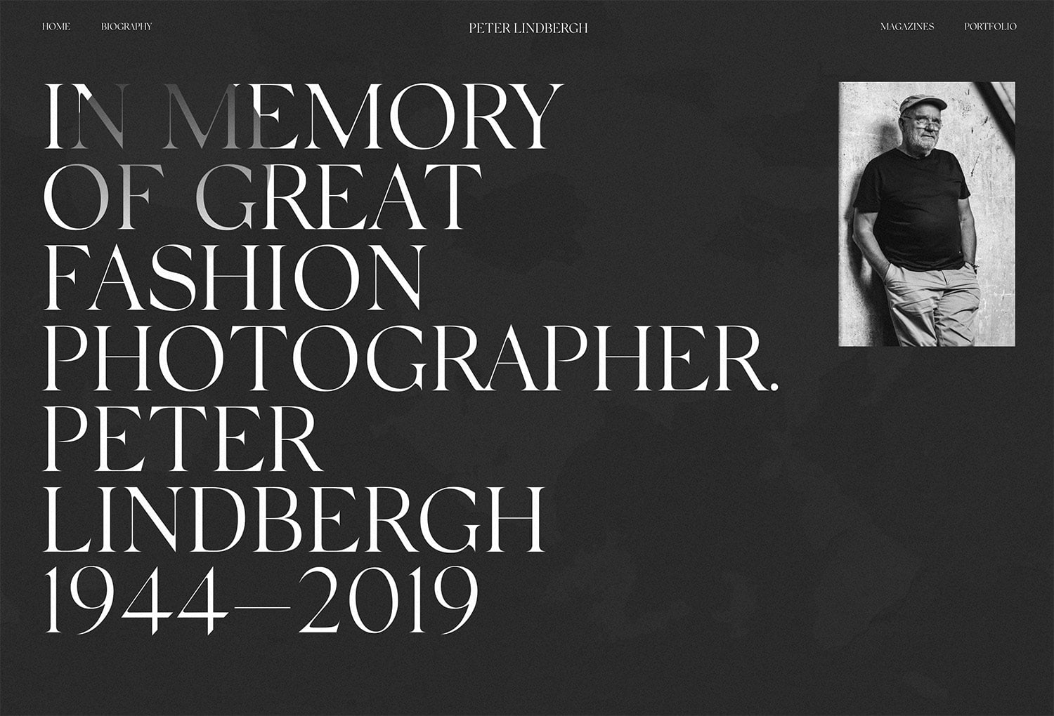
Dark mode is everywhere. Thanks to the ability of most browsers and mobile devices to toggle between light and dark modes, you need to consider how your design might look with a dark color scheme (even if that is not the default).
Because of the popularity of dark mode as a user preference, even more designers are reverting to deep, dark color palettes for overall website and user interface designs.
These projects often have a moody effect, so it is important to think about how dark mode impacts the overall vibe of the message and content of the website design even if you aren’t planning a toggle option.
For designers that are creating a lighter interface, think about and design for how dark mode will look if the user selects it. Remember that dark mode isn’t just a reversal of the color palette, it should be an intentional combination of deeper, darker colors that create the same visual feel as light mode and maintain readability and functionality.
A few tips for making the best of dark mode in website design include:
- You don’t have to use “white” and “black;” think of dark mode in terms of light and dark. (Maybe use a pale gray on a dark purple background.)
- Stay away from highly saturated colors on dark backgrounds.
- Use color variations (light and dark) to establish hierarchy.
- Provide a toggle switch for light/dark mode so users can choose how to look at the design.
- Don’t forget accessibility in dark mode and take care with size and contrast.
Experimental Typefaces
Fig
Hot Black
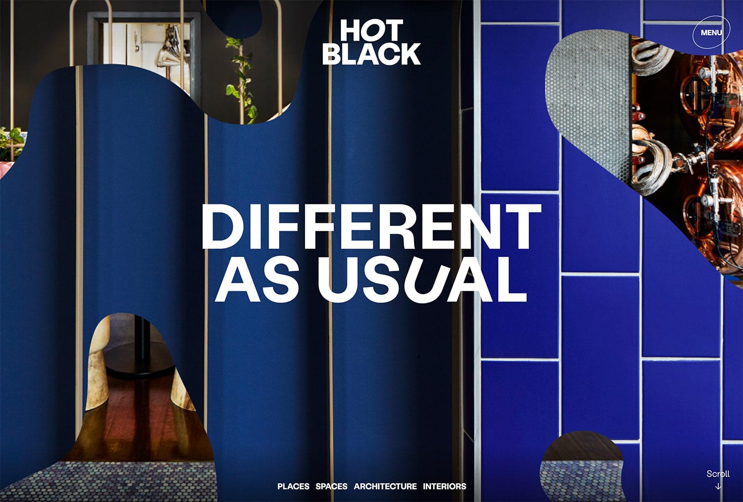
Thanks to improvements in delivering fonts online, experimental typefaces are gaining popularity in website and mobile app projects.
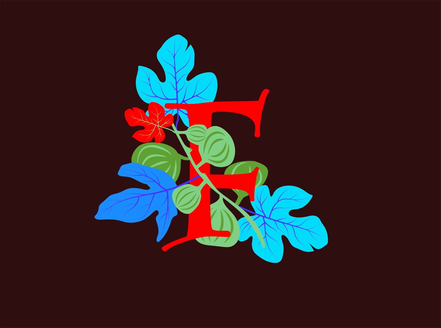
These typefaces are anything different or unusual or even custom to a project. Experimental typefaces range from amazing elaborate pieces of artwork, such as the F above, to little surprises as part of a more standard typeface design.
Experimental typefaces might be a single color of style, colorful, animated, and include full- or abbreviated character sets.
A few ways to make the most of experimental typefaces include:
- Keep the rest of the design simple since these typefaces can have a lot of visual emphasis.
- Pair with highly readable secondary typefaces.
- Consider a custom experimental typeface for key elements, such as the one used for the Designmodo logo.
Designs Without as Many Faces
Bier in Balans
Persoo
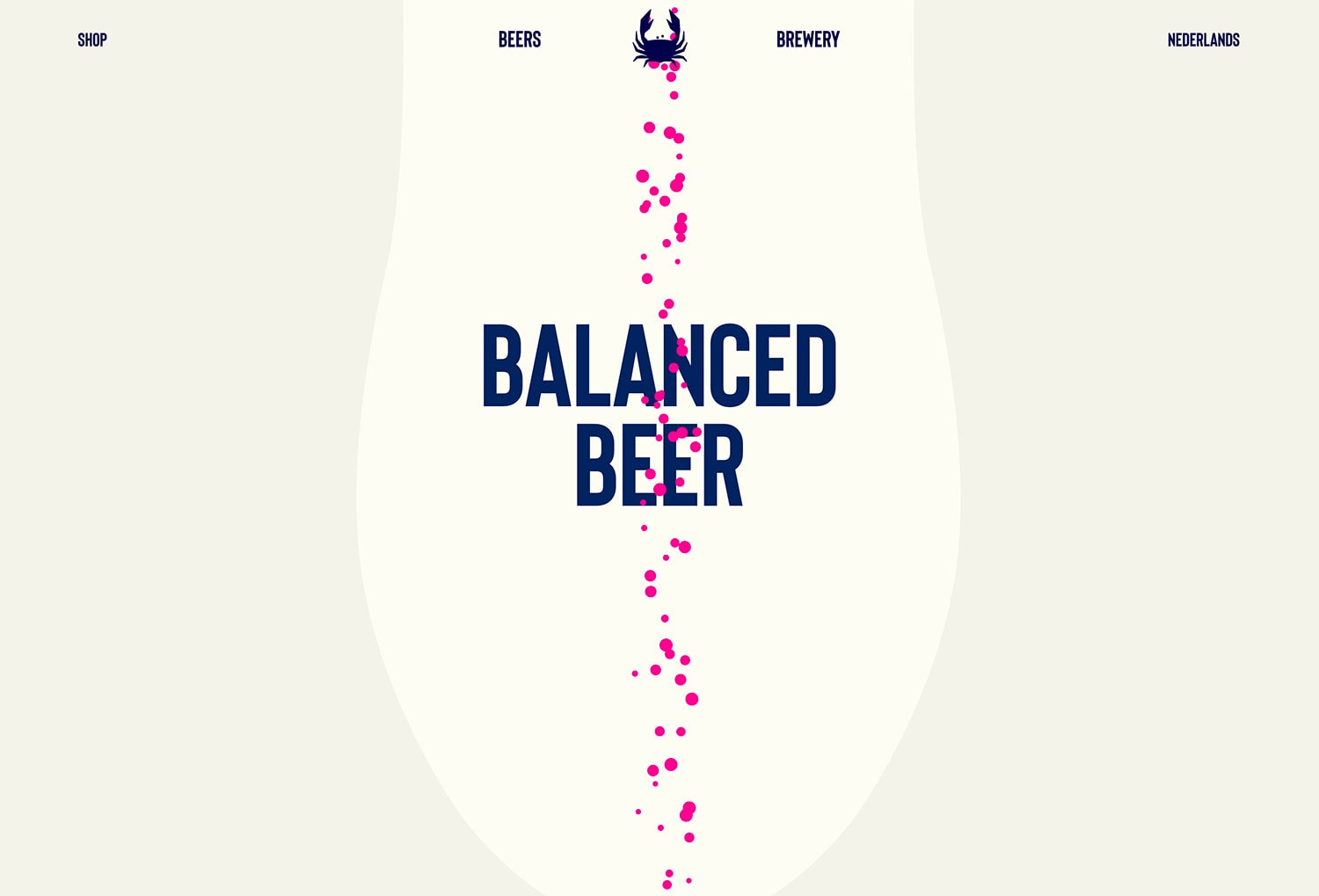
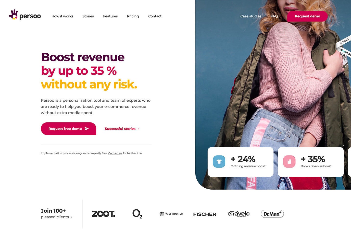
This trend might be a direct result of the worldwide coronavirus pandemic – designs are featuring fewer people and faces.
The reason for this is quite practical: With people not gathering in groups and with mask-wearing, designers are looking for ways to use existing inventories of images to establish appropriate imagery. Or they are opting for imagery without people all together.
This might be the first time that you scan various websites and see so few people.
While this is a big trend right now, don’t expect it to stick with us for long after the pandemic as people begin gathering in bigger groups again.
Text as Homepage “Art”
Krown Themes
Sofia Papadopoulou
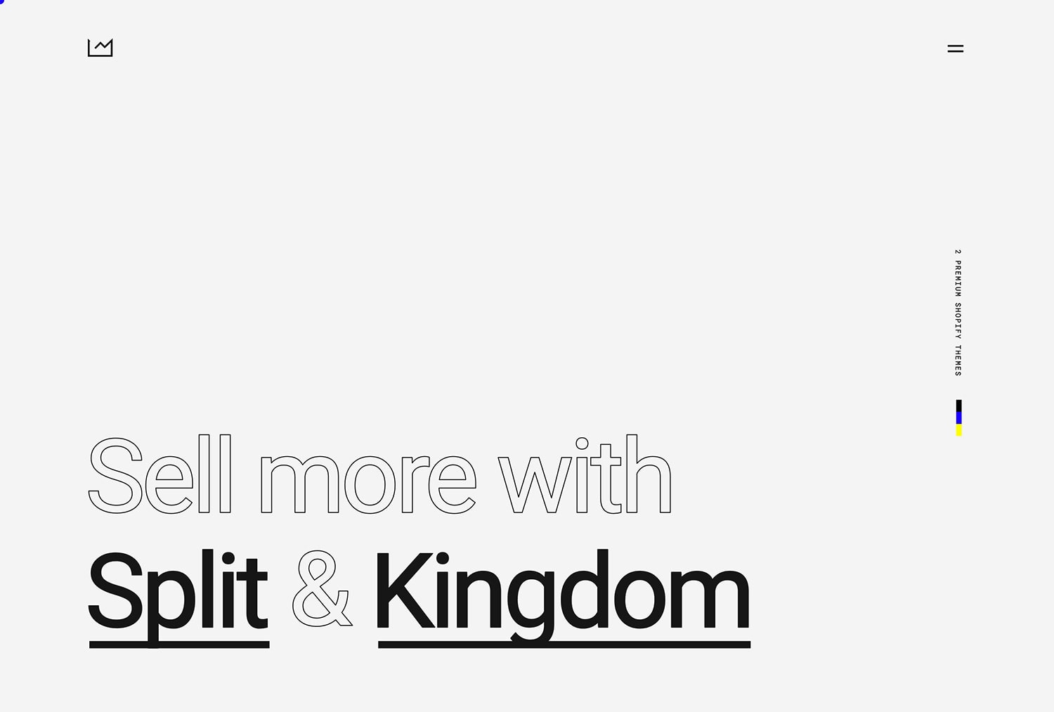
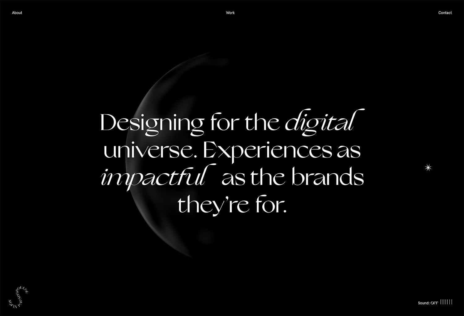
With so many great options for typography, including the oversized and experimental trends above, it’s no shock that many designers are using text as the main “art” for designs. (This also plays into the trend of using fewer faces in design.)
While this might sound like an easy out, typography-heavy designs are complicated and complex. The more words – and longer words – that you have, the more of a design challenge this can become.
Designers are playing with layers of text to create focus, such as filled and outline pairs in the example from Krown Themes.
The other popular option is to stack lines of text with tight linespacing or exaggerated open linespacing to create a feel and eye flow for the design. The common theme is that each of these projects uses a typography that’s interesting and matches the mood of website content.
Blur & Noise (Grain)
Blurr
Mutant Radio
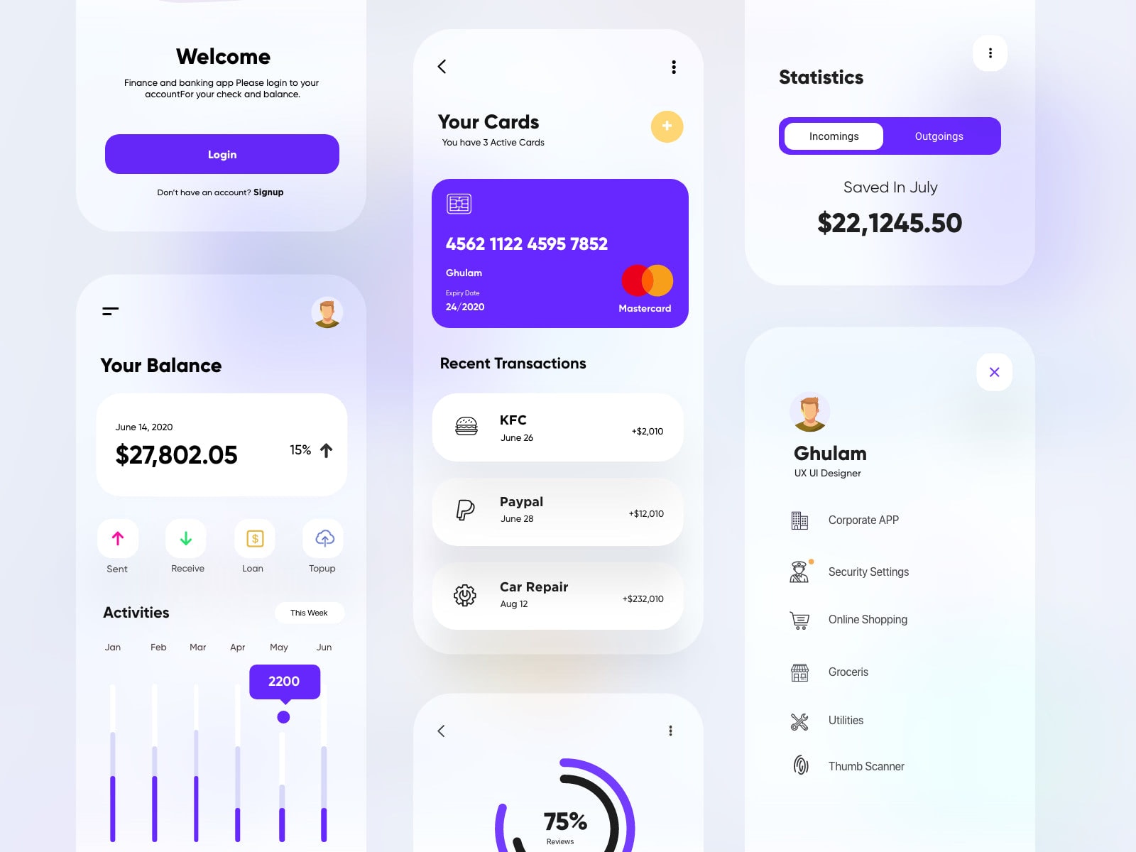
App UX-UI Design
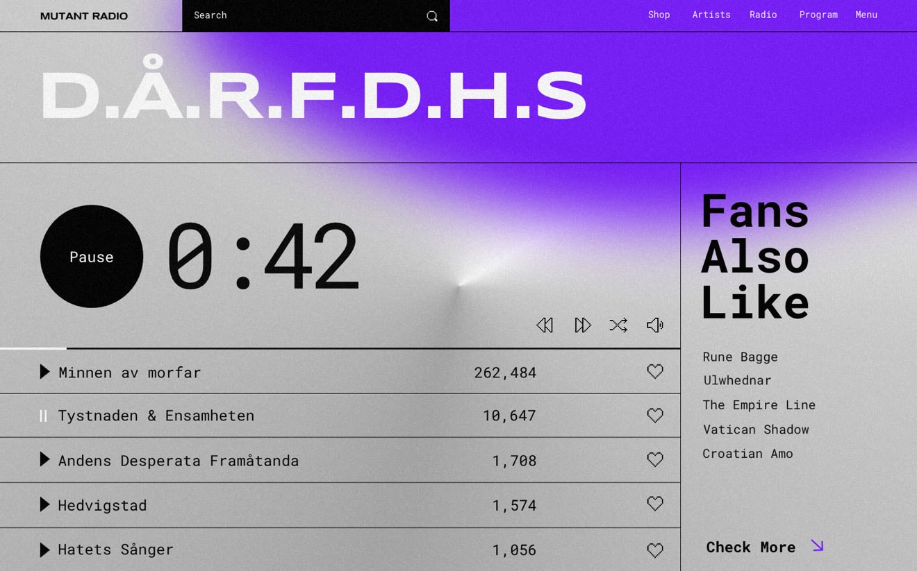
Blur and noise are, perhaps, one of the beloved comebacks of 2021. All we remember how these two took the web by storm more than five years ago. Not only did they make website design feel sophisticated and refined but also mobile applications and all other sorts of interfaces and artworks. Today we can witness a new milestone in their development.
So how to nail it?
First and foremost, in 2021, they work together. Do not separate them since they make a cute couple that gives an interface a refreshing elegance.
Second, you should forget about blurred images. The time has come to play with colors and gradients. This approach lets you come up with ultra-modern and highly artistic splashes of paints that feel incredibly subtle. They add mood to the design and, at the same time, serve as unobtrusive focal points that emphasize crucial details of the interface.
Third, use a combo of blur and grain as a transition effect. On the one hand, it will make shifting between sections look smooth; it goes incredibly well with sliding and parallax. On the other hand, it will make motion feel tangible.
Finally, use them in tandem with neomorphic details. These two directions nicely complement each other. When applied together, they amplify the overall effect exponentially.
Circles
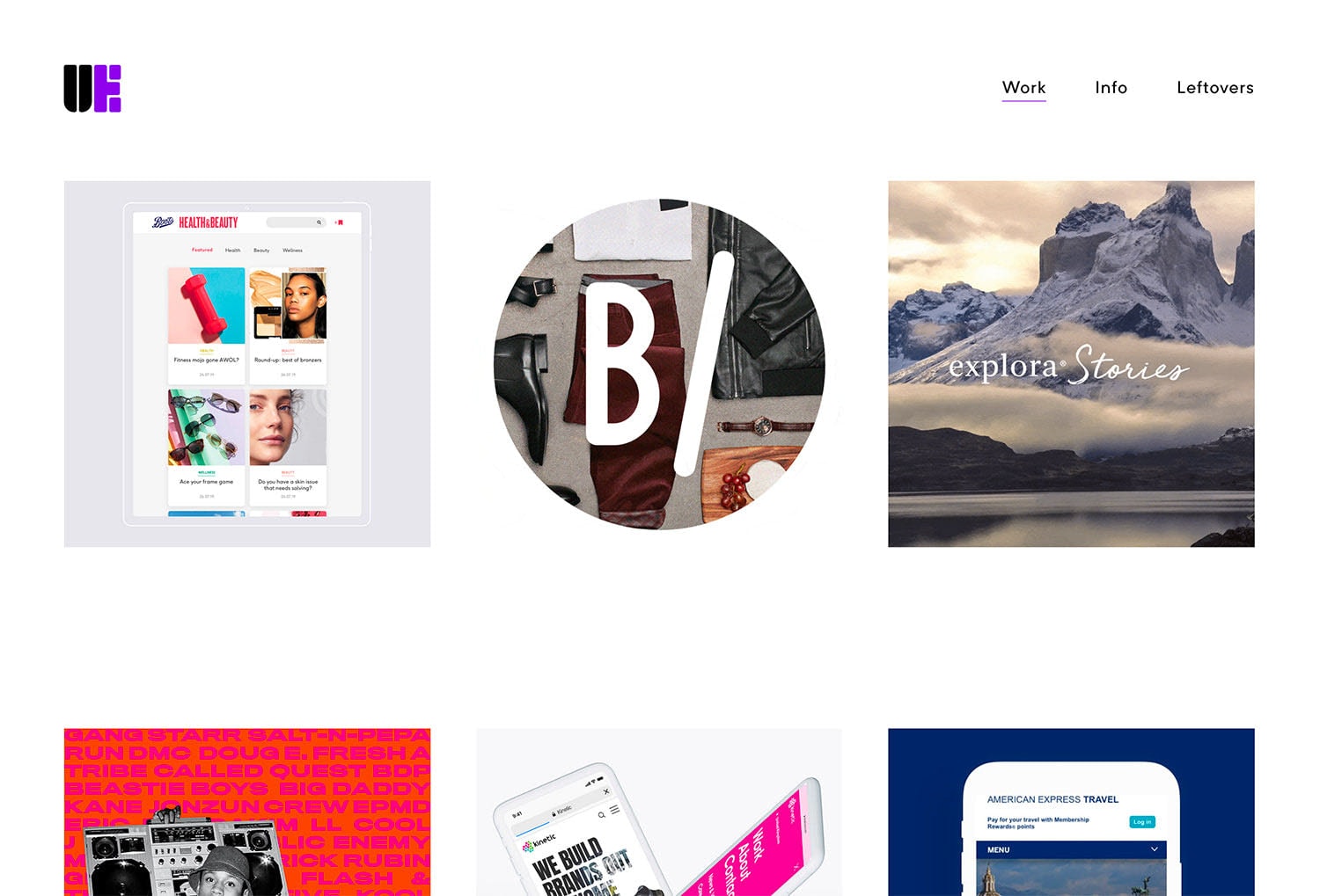
Upperechelon
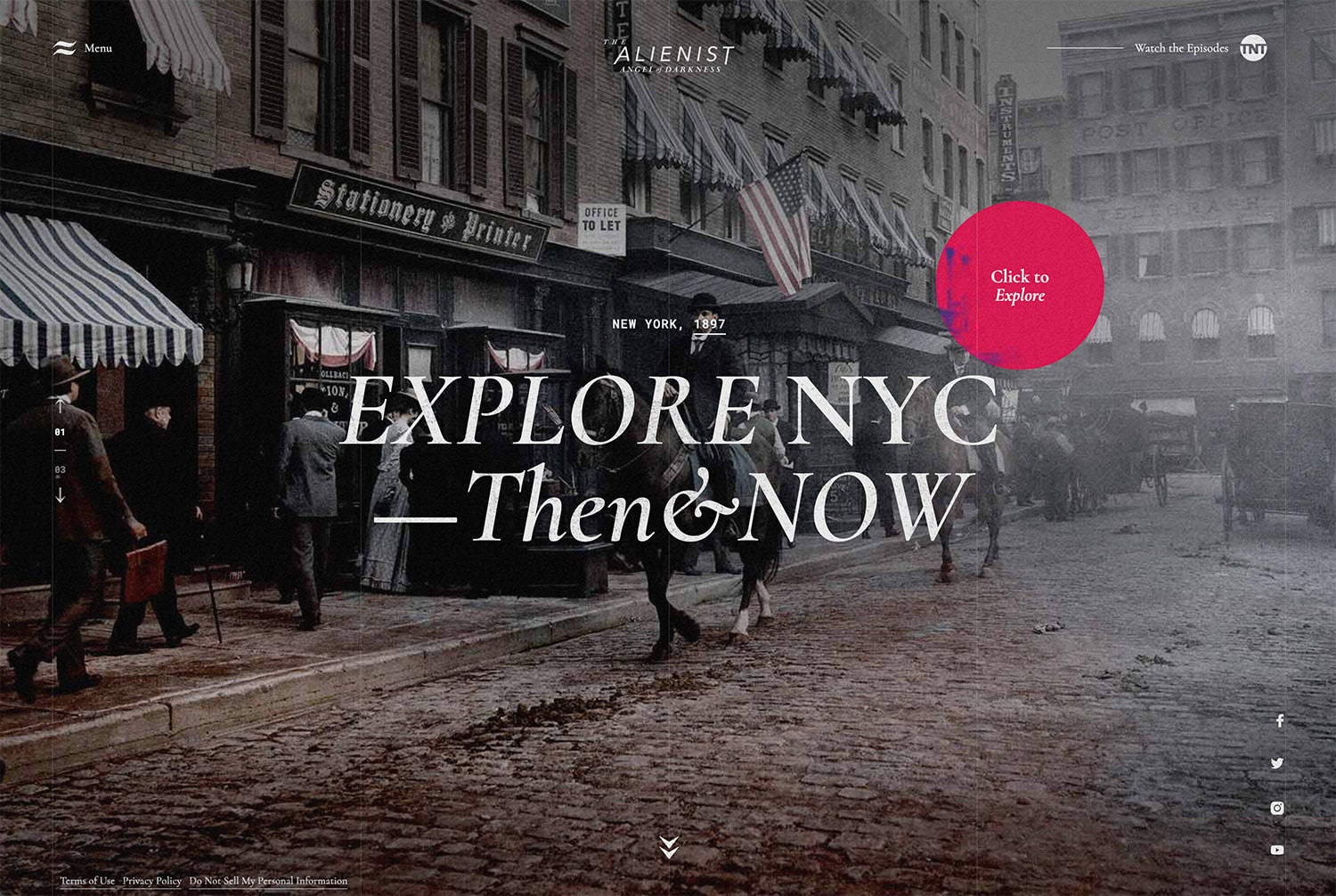
The Alienist
Circes might be the most popular geometric shape of 2021. Designing with geometry has been trending for some time, but circles are really beginning to emerge as the favorite shape in this trend.
That might be because of the implied meanings of circles – wholeness, perfection, infinity, motion – or because they can really bring visual focus to a certain area of the design.
Note how the eye is immediately drawn to the circular areas in each of the examples above, thanks in part to the way circles contrast with the rest of the design.
In one example, the circle contains the animation, whereas in the other it moves within the scene without movement therein. Circles are also a popular option for mouse or cursor states as well.
3D Illustrations (And Everything Else)
Monsieurnoss
Edesigninteractive
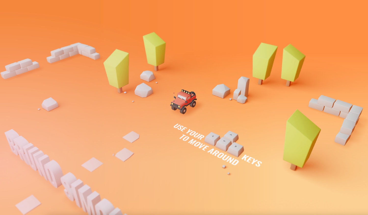
Bruno Simon
Cilau
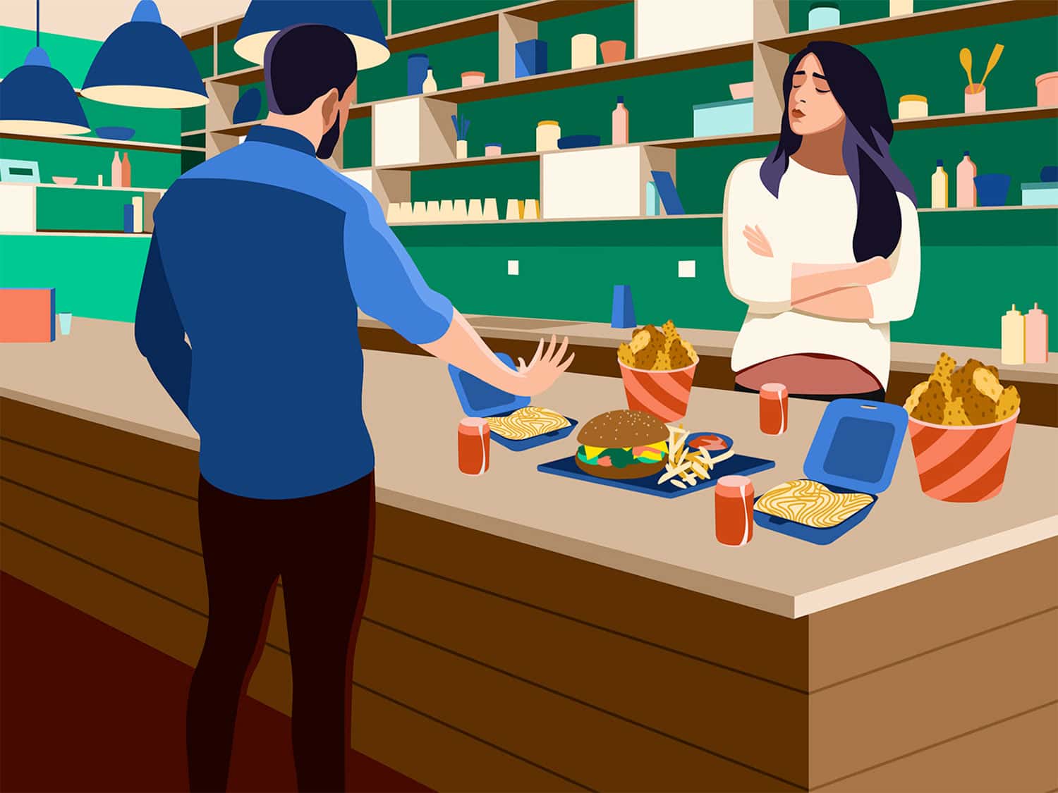
The lines between reality and virtual reality keep blurring. Three-dimensional effects and techniques in the 2D space are a great example of that in action.
Designers are playing with everything 3D, from illustrations and animations to scenes created with objects and images.
The examples here focus on illustrated styles. Illustrations can take on 3D effects and depth with shadows and just the right thought in the creative process. This trend might result in something with a more realistic feel, such as Google’s Healthcare Security page, or a lighter, more cartoonish scene.
Black and White Illustrations (Colorless UI)
Eatgenesis
Cpeople
Absurd Design
Magnet
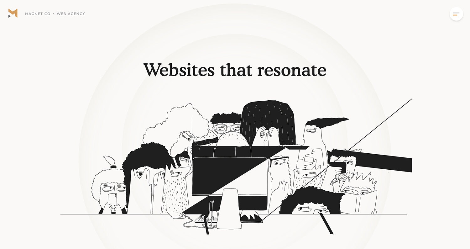
Other types of illustrations also remain popular, such as black and white drawing styles. These may be simply flat drawings or include extra elements of animation or whimsy to make them have even more impact.
The nice thing about these illustrations is they seem real and in-the-moment because of a hand-drawn element.
These illustrations seem to “match” almost any design aesthetic as well, making them a popular option for all kinds of industries or website types.
Collage Art
Collagerie
Annual Awwwards
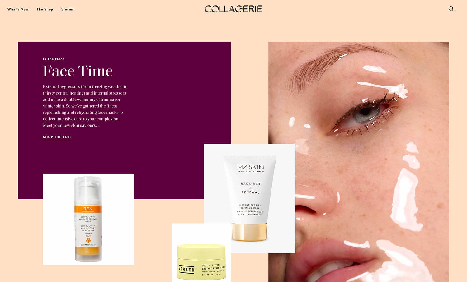
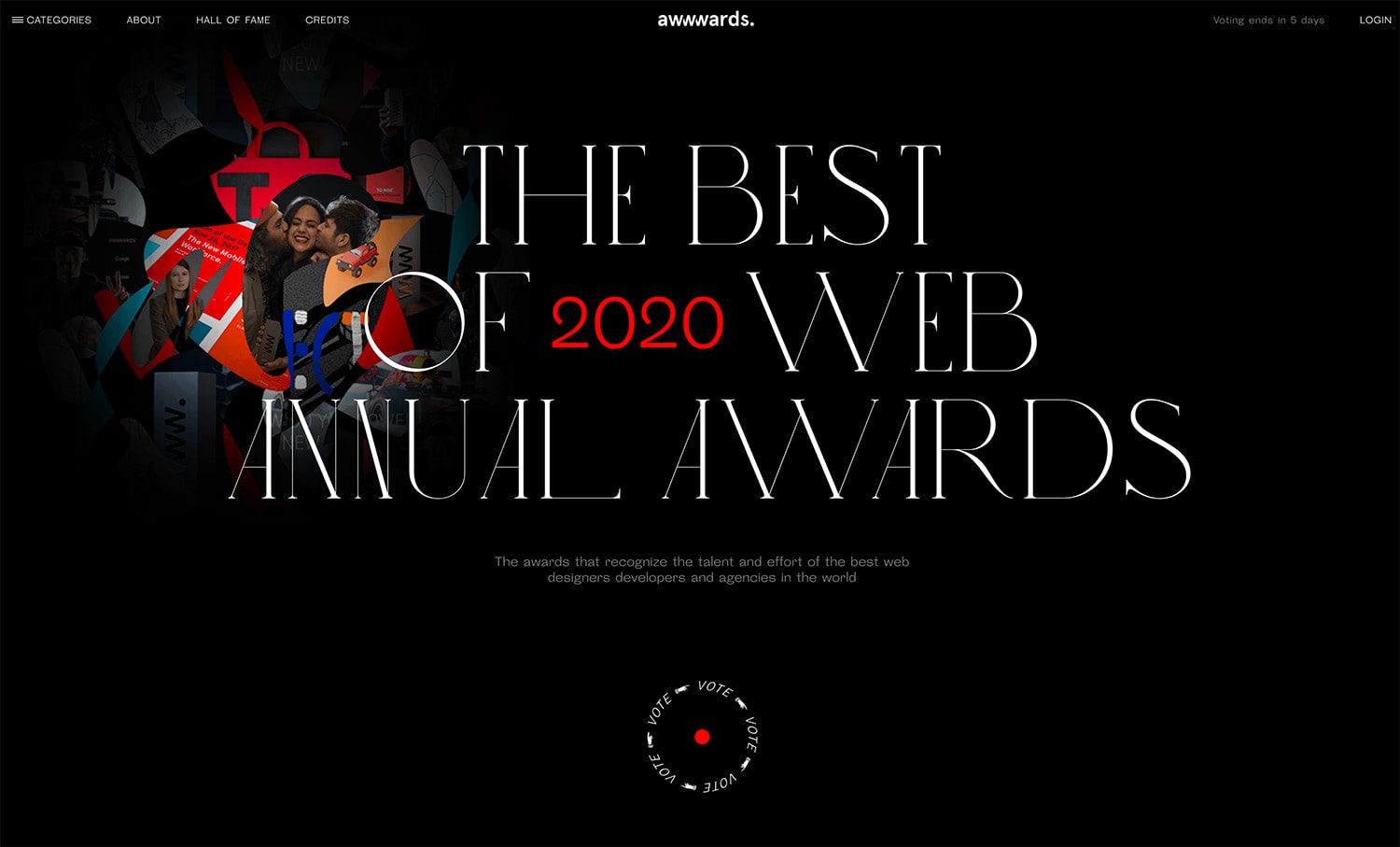
Sometimes the most impactful website image is actually a collection of images. More designers are opting for collages as the main artwork on pages.
This can look a few different ways (you can see that in the examples above).
- Images can be placed throughout the design in their own “containers” or boxes, creating a layered collage look.
- Images can be combined and merged to create a single, more unified piece of art that’s a collection of pieces.
Both options can be equally stunning and work for various projects.
Consider a bit of collage art if:
- You need to show multiple images at once.
- Want to establish a retrospective feeling.
- Don’t have a single image that provides the right message.
- If you don’t have a single high-resolution image. Sometimes combining images can get you there.
- When you want to showcase diversity or breath within your brand line.
Colorful Backgrounds
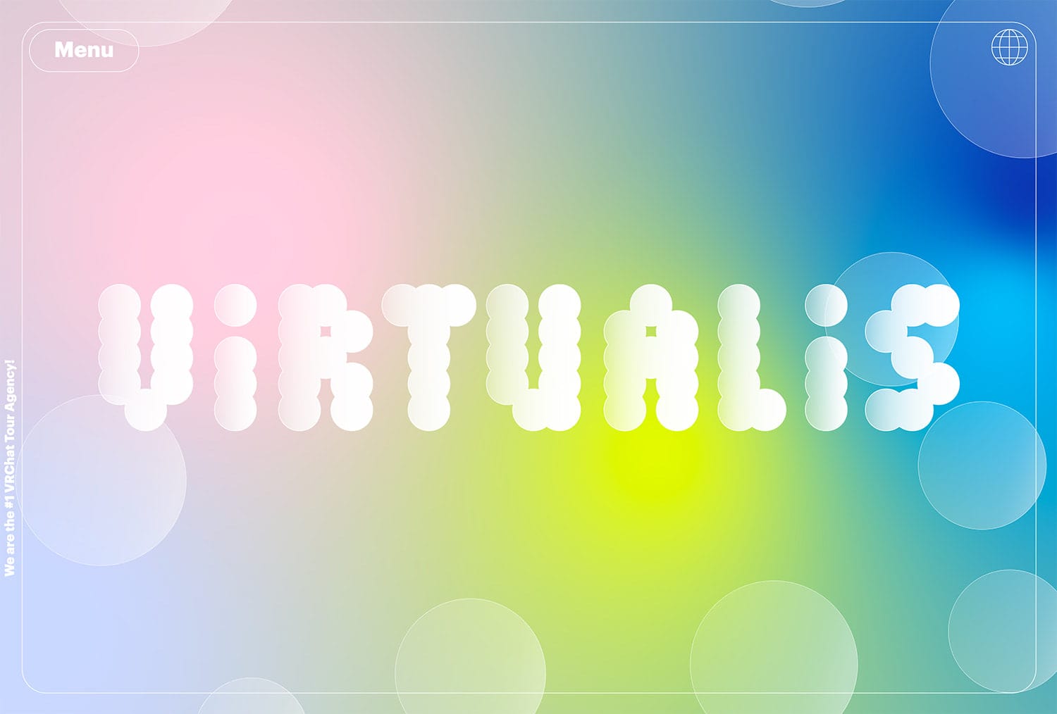
Virtualis
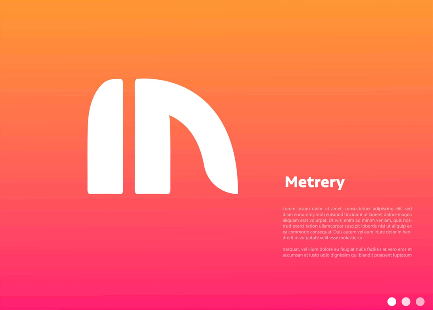
Metrery
Almost on the other end of the spectrum from dark mode is use of colorful backgrounds for design projects. The use of bright color might be a reflection of the world right now and a desire for better, brighter times in a pandemic era.
For the most part colorful backgrounds come in two forms – gradients and blurs.
Both are fun options that allow you to really play with color combinations from amazing bright hues to softer more rainbow-style palettes. The common theme when it comes to this trend is a happier, lighter feel thanks to colorful background choices.
Big, Bold Typography
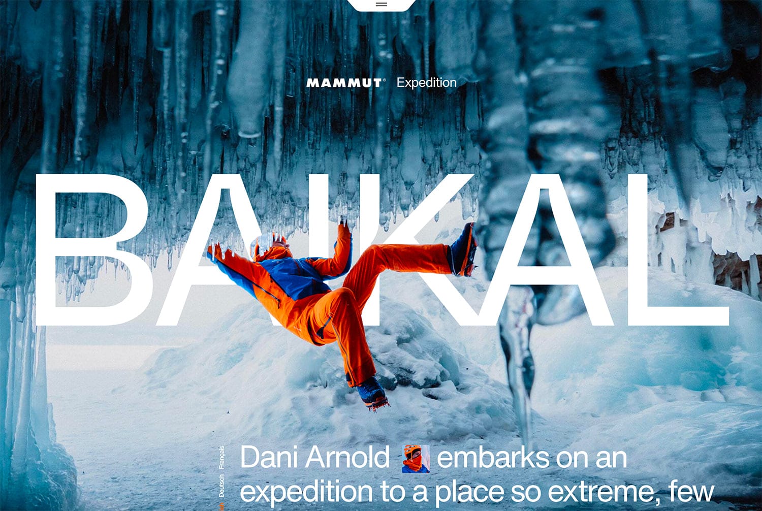
Mammut
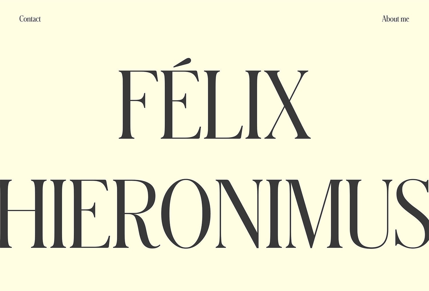
Felix Hieronimus
Typography that’s larger than life is another big trend heading into 2021.
The bigger the letters, the more impactful they can be. This trend works best when there are just a few words to focus on and they are easy to read and understand.
Type styles are all over the map as well, from thick sans serifs to thin and funky serifs to scrips and slabs. The style of your font choice doesn’t matter as much here. It’s size that really makes this type trend work and feel over the top.
And the good news is you can use it with busy backgrounds or images or on a flat background where text really stands alone.
Tips for using big, bold typography include:
- Determine first whether text should be readable or artistic. (If you go with artistic, make sure to include a secondary readable option for secondary elements.)
- Go big with a trendy typeface, such as a serif or outline.
- Keep the background simple so emphasis is on the text element.
- Remember to think about the responsive nature of text elements and how big text will look in vertical spaces or on small screens.
- Keep letters and words to a minimum so you don’t overwhelm users.
Cool Mouse/Cursor Icons or Actions
Pentool
We Are Impero
Loewe
This is a tiny trend that you might miss if you are not paying attention – mouse and cursor states that change into interesting things as you scroll, click, or hover.
This delightful trend not only shows the ability to the design but serves as a way to truly delight the user.
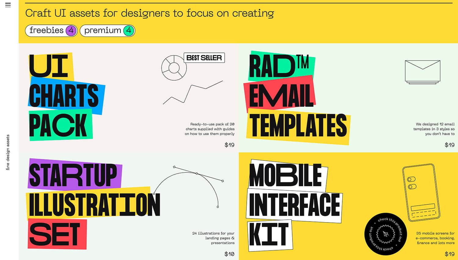
The Pen Tool, above, uses a big circular “pointer” that moves with the user. It’s hard to miss and the size of the cursor (even without an actual point) makes you want to click around.
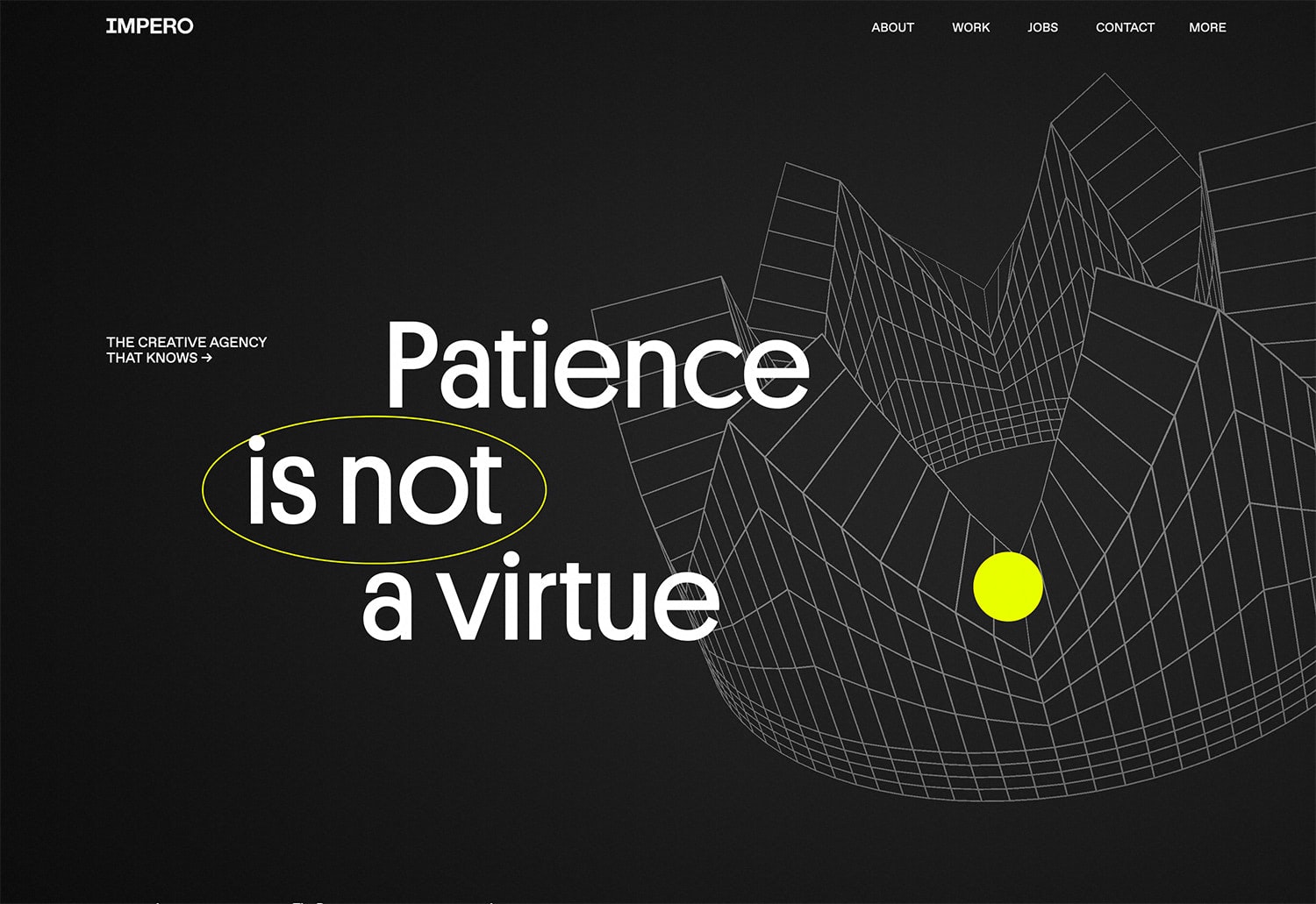
Impero uses a bright yellow circle that floats around the screen with the cursor. It does make other objects animate or move as it approaches and, again, encourages clicks.
This is a fun trend that makes you want to browse from your desktop computer even more since many of these little effects just don’t feel the same on a mobile device.
Pantone’s Illuminating and Ultimate Gray
Pantone
Busy App
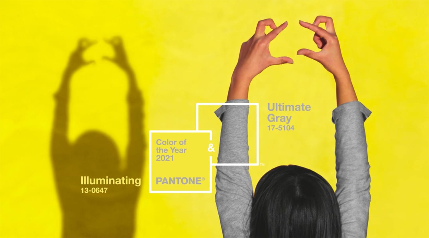
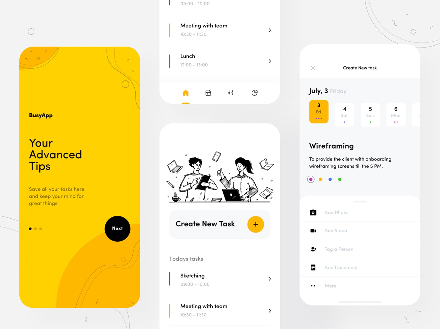
Finally, it’s hard to mention trends of the year without the pair noted by Pantone as colors of the year. Illuminating (yellow) and Ultimate Gray and the yin and yang of design with a bright, bold choice that works with a more muted neutral.
(Admittedly, this is one of my favorite color pairs that I’ve used for years. Seeing it as the color of the year is quite nice.)
This color pair isn’t that new to interfaces either. It’s fun, light and works great with more minimalist design schemes or line icons and illustrations. The yellow is impactful and youthful while gray keeps it from feeling overwhelming.
This pair of colors is a nice option if you want to create something with just the right element of cheerfulness and hope.
Conclusion About Web Design Trends for 2021
None of these website design and UI trends for 2021 work in isolation. They are all best when developed and designed as part of a thoughtful and intentional design scheme.
Take note of how many of these trends also overlap with one another. Designs might have dark mode and circles or oversized typography on a bright background. The versatility of these design trends makes them highly usable, layerable, and perfect for your upcoming projects. Have fun!
Credit: a few videos and images have been provided by Awwwards.

