The way we conduct business and how we communicate with clients undergoes constant changes. A decade ago, people preferred face-to-face meetings in the office; today, even serious issues are easily addressed through Zoom. More and more people choose digital. However, it does not mean that your traditional company will become extinct. Anyone can adapt to an ever-changing world. This article will talk about the most important email marketing trends in 2021.
The good news is, time-proven ways to reach clients are still working. Email marketing is alive and effective. According to Litmus, 2020 was a year of email for all; 2021 will not be any different. The growing value of email marketing is evident. It is one of the most trusted communication channels. Everyone is going to use it to promote their products, advocate their brands, communicate with the target market, and rake in cash. Therefore, it is time to focus on your email marketing campaigns and strategies.
We have already discussed eight email design trends that will help any entrepreneur acclimate to the upcoming year’s needs and challenges. It is time to consider some effective ways to ensure your email marketing strategy does not fall flat. in continuation we’ll describe in detail the email marketing trends for 2021.
Email Marketing Trends for 2021
Personalization
A lot has been said about personalization. Nevertheless, like it or not, personalization is the key to success. It was imperative last year, and it will be crucial the next one, no questions asked.
As Adam Q. Holden-Bache, one of the leading email marketers, believes in 10 years email will be fully automated with 100% personalized messages driven by artificial intelligence. Indeed, slowly but surely, we are moving towards a hyper-personalized experience. Although AI-based systems are not a valid option today, you can still achieve pretty amazing results with manual personalization. Using stats provided by your ESP, you can easily cater to customer’s needs and create a newsletter that is a direct result of subscriber’s behavior, history, preferences, and interests.
If you have doubts, get this; according to Instapage, personalized messages have an ROI of 122%, whereas the National client email report states that targeted emails generate 58% of all revenue. In 2021 when the competition will be cut-throat, these numbers may help to stay your company afloat.
Online Email Template Builder
With Postcards you can create and edit email templates online without any coding skills! Includes more than 100 components to help you create custom emails templates faster than ever before.
Try FreeOther Products
Personalization is a tricky thing. Using the client’s name in the copy and subject line is not enough. It requires much more. For instance, the main pillars of good personalization are:
- Getting segmentation right
- Optimizing send times according to the user’s historical open patterns
- Using dynamic content depending on the user that you’re sending to
- Matching email frequency to engagement levels
- Establishing a personal brand connection
- Creating individualized destinations
Putting clients first and thinking about their problems is a tactic that never lets you down. Many brands benefit from it, exploiting it in various campaigns. For instance, hyper-personalized automated campaigns lie in the heart of each and every cart abandonment newsletter. It is a time-proven way to get your customers back and nudge them to finalize the deal. Consider an email from Jack Wills as a representative example. It positions itself as a reminder, not an abandoned cart email. Though we all know what it is.
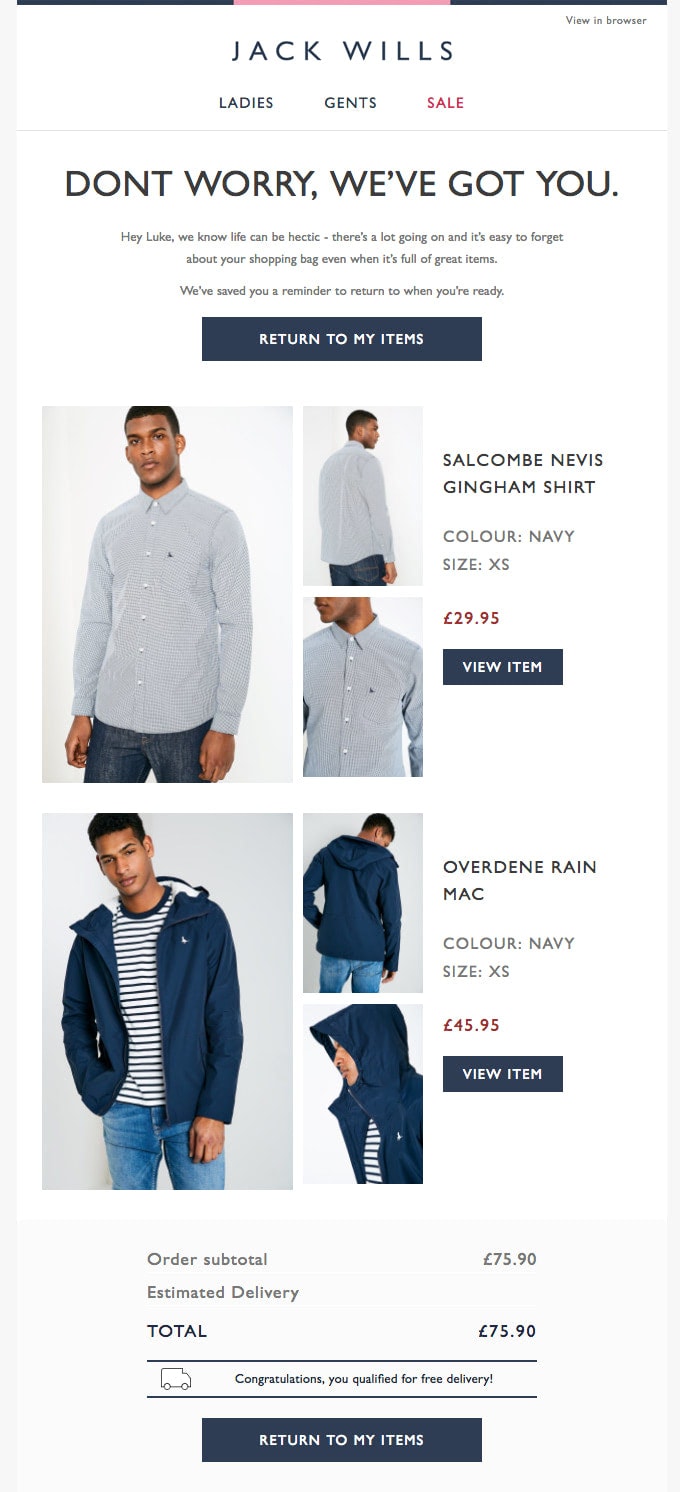
The newsletter is brilliant. It includes the small message addressed to the client with the name on the top, items left in the shopping cart, and cross-selling blocks generated according to the client’s purchase history and preferences. It also has shopping incentives such as free shipping and a reminder about a huge sale, and CTAs that lead exactly to the checkout page so that customer can finalize the deal without extra moves.
These tiny details like a direct link to checkout, items left in the basket, cross-selling, and name make the real difference. They speak directly to the customer, bring him or her value, and connect on a personal level. Personalization helps this newsletter win customers back and recover lost revenue.
More Customer Appreciation Emails
According to Experian, birthday emails are capable of generating roughly 342% more revenue than a regular promotional email. It means that customer appreciation emails, even without a pandemic, are enjoying high rates playing a vital role in a company’s financial success.
In 2021, subscribers will crave empathy from your brand more than ever. COVID-19 has accelerated the need to put the customers at the heart of your strategy on all levels.
Therefore, customer appreciation emails give you a perfect chance to praise prospects, provide a helping hand, and create a much-needed emotional connection are more in-demand. They will help your brand strengthen the relationship, build trust, inspire loyalty, and increase engagement.
The great thing is, customer appreciation emails already come in all shapes and sizes so that you have various opportunities to reach out to your clientele, such as:
- Birthday Emails
- Anniversary Emails
- Milestone Emails
- Exclusive Offer Emails
- Early Access Emails
- Engagement Emails
- Thank You Emails
However, that’s not all. The pandemic has pushed brands to come up with original solutions since drastic times require drastic measures. Therefore, famous brands have already created other types of customer appreciation emails.
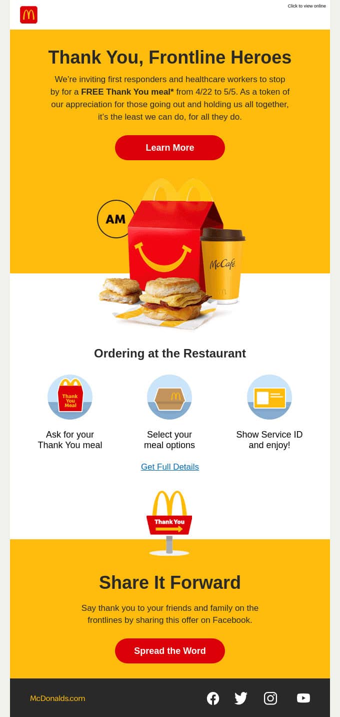
For example, consider an email from McDonald’s whose team uses Covid as an excuse to send more brand emails during the year. This customer appreciation email dedicated to frontlines and healthcare workers nationwide is a true masterpiece. It sends thanks to NHS workers and at the same time advertise their free lunches.
This philanthropy instantly wins over subscribers. In 2021, everyone expects brands to be more community-aware; this newsletter just fits the bill. It increases trust and earns extra points for the brand. Plus, it has sharing options that let this campaign benefit from word of mouth that, as we all know, may generate outstanding results.
Another good example is the email from Harry’s. It is less generous; nevertheless, it is enough to take the brand above the competition.
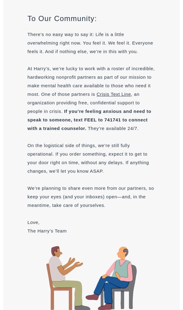
The newsletter from the leading company in the beauty and personal care sector includes a message that addresses the community and subscribers. It has a thank you note and discount demonstrating empathy. More so, it is made in a plain-text email style; therefore, it feels incredibly personal and individualized. The newsletter supports the customer in drastic times and brings actual value to her or his inbox. This strategy not only cements the relationships with the customers but also wins extra points for the brand.
The customer appreciation email is not only about sending your love to loyal fans and enveloping everyone in your charm and positive vibes. From the email marketing point of view, they are part of retention that is a critical stage in the customer lifecycle. As we have said already, the philosophy of putting your clients first helps you to conduct your business in 2021 triumphantly. It will ensure the success of any venture as well as build a proper image of your brand.
Mobile Experience
A poor mobile experience makes 52% of users less likely to commit to a company. If you think experience in email design is another story, then you are wrong. The mobile experience is increasingly vital in every sphere, especially with long-read approaches and creative solutions gaining popularity.
According to Wolfgang Digital’s KPI Report, mobile browsing has surpassed desktop browsing by almost 20%. It is impressive. Besides, according to Litmus, mobile enjoys higher open rates than desktop or tablets. Therefore, even though 56% of respondents prefer to finalize purchases through desktop, still the importance of contributing to the mobile experience is undeniable.
More so, 2020 brought us numerous physical limitations and restrictions (it is already too much to handle), do not build other barriers. Therefore, the mobile experience should be flawless.
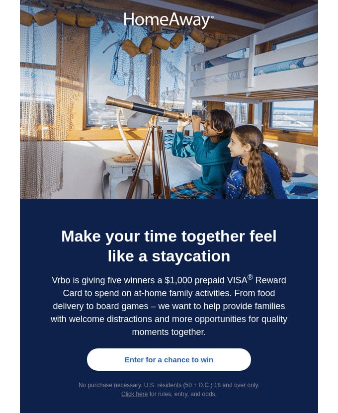
Consider an email from HomeAway. The newsletter accommodates lots of chunks of information. There is a traditional hero area, two-column layout, promo section, header, and multifunctional footer. Nevertheless, thanks to a flexible and fully responsive layout, everything looks great on all devices, and all customers have an opportunity to enjoy this email.
Solutions
Mobile optimization is not an easy task. It requires a lot of design and code to be done. Add to this inconsistency in how emails display across email clients, and creating perfect email design turns into a real challenge. Therefore, it comes as no surprise that according to researches done by Litmus, it takes one-two weeks for the majority of brands to create a good email newsletter. Imagine how much time and money is lost during this period.
To see through, use professional instruments. Automation is a huge email marketing trend. According to recent findings, more than 40% of companies say email marketing is under-resourced, and only 12% plan to add full-time email staff. Therefore, without a good tool in your arsenal that will do all the heavy lifting for you, you simply do not have a chance to stand the competition.
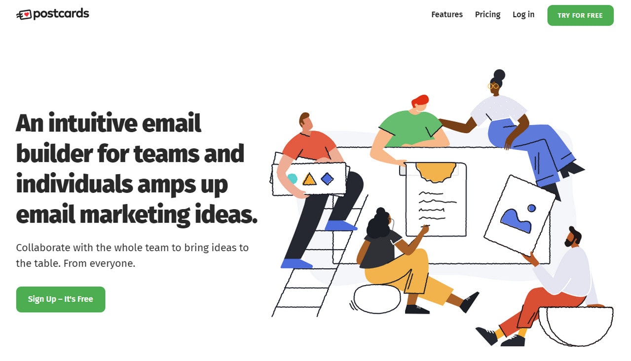
There are numerous solutions out there; for instance, you can use Postcards that prioritizes mobile experiences and provides the best responsive behavior among the competitors. Not only does it offer a solid foundation to build fully responsive, mobile-friendly, and retina-ready email templates, but it also has lots of other helpful features like modular system, version history, cloud image hosting, one-click export to favorite ESPs that will help your company to stay above the competition next year even without full-time email designer.
Dark Mode
When it comes to nailing mobile optimization, it is vital to remember trends within this area. This year much like the previous one, dark mode is going to be highly in demand. According to Litmus stats, 36% of Apple iPhone users read emails in dark mode.
Pandemic played the role of the catalyst. The lockdowns and physical restrictions that pushed people to spend more time on the internet boosted this tendency. Spending more time in the digital World rather than in the real one brings about some discomfort for the eyes. Dark mode reduces eye strain in low-light conditions. Therefore, it is getting much more popular these days.
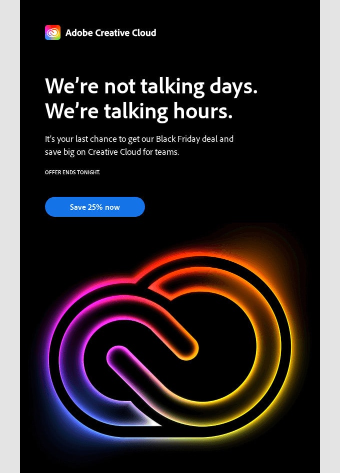
Take a look at some big names whose teams have successfully adopted this tendency in their email designs. The first one is Adobe with its Black Friday blast.
It provides a great reading experience. Plus, it conveys the atmosphere of the event, sets everyone in the right mood, and makes the email look modern and stylish. In addition, it is fully optimized and renders excellent across all screen sizes. Brilliant.
The second one is a newsletter from Uber. Uber uses dark mode and cards to help the newsletter gracefully accommodate all the information and provide a great reading experience. It also plays nicely with the blue tone used for accents. The layout is based on a flexible 2-column layout that easily transforms into one with an ample amount of whitespace, making it look great on small screens as well.
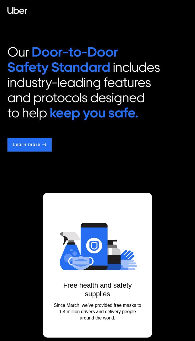
Prioritizing mobile-friendliness and trends in this area, Uber speaks with the audience in the same language providing a comfortable environment where subscribers easily fall for marketing tricks.
Entertaining User Experiences
According to Studies by Salesforce, 68% of customers have elevated their expectations of brands’ digital capabilities.
Long gone are the days of boring sales pitches. Replacing the physical experience of purchasing with something valid in the digital World is increasingly vital these days. Users expect to be treated like contacts who deserve nothing less than a great customer experience throughout their life cycle. Therefore, entertaining user experiences in email designs that perfectly make up for this shortfall are gaining popularity.
The good thing is, you are blessed with some good options that are:
Each option has merits. For example, animated gifs are already time-proven tools to add spice to user experience, establish an atmosphere that meets the event, and of course, play marketing tricks like evoking a sense of urgency or drawing attention to shopping incentives.
AMP brings us closer to the realities of doing shopping right from the inbox that customers in 2021 find highly desirable. You can already add such features as a carousel with various shopping options that allow users to view products and add their choice to cart right from the email, skipping all the hustle of finding this product in the store. It dramatically reduces the length of a customer’s journey, making it short and efficient. It also reduces friction and eliminates all the frustration that may appear during the customer’s lifecycle.
As for the gamified experience, it is still a distant future, though, with clever use of interactive features, you can emulate this kind of experience and even make sure that a particular segment of your subscribers will be able to enjoy it.
Let’s consider some good examples.
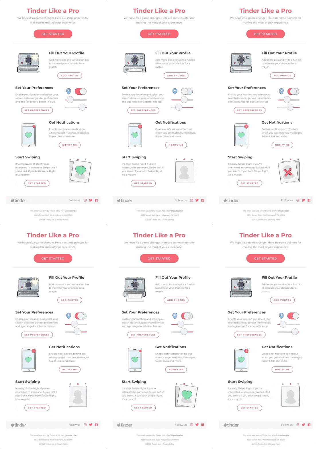
The first is an email from Tinder, whose team uses animated gif with several illustrations set in motion. Each animation supports the steps that users should take. They clarify things and help to create a friendly atmosphere. As a result, the onboarding feels less painful for newcomers. This move cements relationships with new customers and gives them a good start.
Another example is a newsletter from Litmus, where the interactive hero area is used to make the customer experience more enjoyable and unforgettable. It also effectively supports the main point and make the message behind this email stronger.
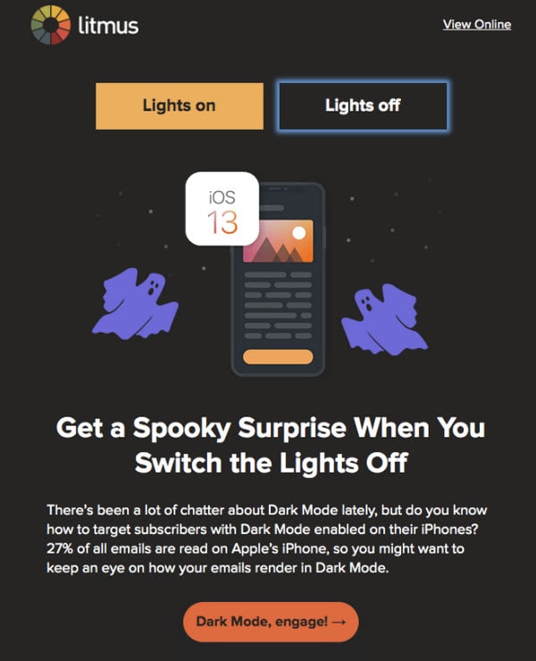
Here subscribers have an opportunity to switch between two modes and see for themselves how dark mode and light mode may change the reading experience. Although this is just one interactive detail, it makes a huge difference.
Depending on your campaign, strategy, and brand, you may benefit from one of these options. However, please do bear in mind these best practices:
- Make sure everything renders perfectly across all browsers and screen readers.
- Do not overload email since more weight means more risk of being flagged as spam.
- Make everything mobile-friendly.
- Make everything accessible.
- Make sure you have the text version and browser version.
Although creating an entertaining experience may require some additional skills, generators like Postcards can add interactive features like interactive hotspots and take user experience to the next level without much hassle.
Stay at Home Atmosphere
Plenty of people are still working from home.
Sadly, but with future lockdowns and restrictions, our life will be indoors. However, it does not mean that we can’t turn it to our advantage. We have already tested this ground. Some of us even were managed to make ourselves comfortable and enjoy some quality family time. As for email marketing, it is time to make your newsletter’s atmosphere more cozy and homely since this type of ambiance appeals to potential customers the most this year.
Huge brands have already done this. They have started with online stores featuring their products within home scenery. The email designs have paraded the same kind of photoshoots. Consider an email from Chi Chi Clothing, one of the leading online-only fashion retailers in the UK.
The brand was one of the first ones who advocated this tendency in 2020. Moreover, the brand shifted its focus to nightwear and loungewear, which are more in-demand. Prioritizing things that are more relevant to the crowd and showing them in situations close to the customers may help to ignite interest and drive traffic.
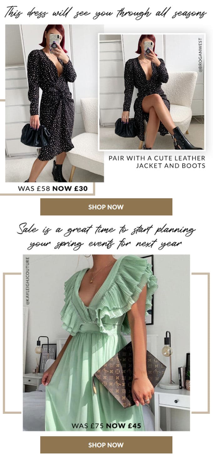
More and more brands capitalize on a warm cozy homely atmosphere. Since it is your customers’ lifestyle, this trick lets you speak with clients in the same language. Featuring products inside home scenery makes them look and feel more valuable since they can be useful right here, right now.
More so, let us not forget about the message that the homely atmosphere adds to the email design. Not only does home feel quiet, snug, and secluded, but it also feels safe and secure. It is your kingdom where all the troubles go away. All these qualities that this atmosphere holds may easily tug customer’s hearts and make their attitude to your brand stronger (in a good sense). As we all know, loyalty means more chances to get your customers to buy from you.
Visuals That are Close to Reality
The stay at home atmosphere is not the only trick that you can use these days to get cozy with your clientele. You can also use visuals that are close to reality. They help to express sympathy and let them know that we are all in the same boat. When the brand positions itself as a company that is always on your side, it exponentially increases trust and loyalty. In such uncertain times, we all need something to rely on. If your brand is this shoulder to cry on, then you will undoubtedly win the competition.
So, what can you use in 2021 to make your brand close to the audience? Several good options have already been tested by famous brands and proved to be quite effective. They are pictures of a single person, pictures of people in masks, and human illustrations.
Pictures of a Single Person and People in Masks
Keeping your distance is kind of a rule that we have learned by heart. Wherever you go, whatever you do, you should always keep a 2m(6ft) gap between you and others to stop spreading the virus. This is another aspect of our life that we have successfully embraced. So why not use it to the company’s advantage.
One way to do this is to use pictures of a single person rather than images of people. Like it or not, we are getting used to sitting alone, eating alone, working alone, and training alone. If your product benefits this new lifestyle, then you will be the winner. This trick shows your customers that you are on the same wavelength with them; therefore, they empathy you and trust you.
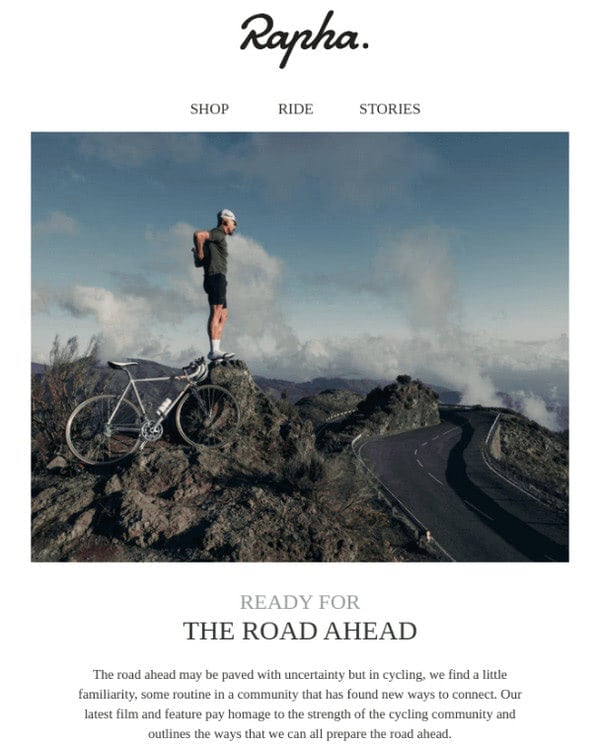
Consider email design from Welly and email from Rapha, whose teams have successfully exploited this trend and made their digital newsletters closer to society.
Email design from Welly calls for all the adventure seekers. Even though the Covid pandemic has imposed some rules, there are still plenty of ways to embark on an adventure and enjoy it.
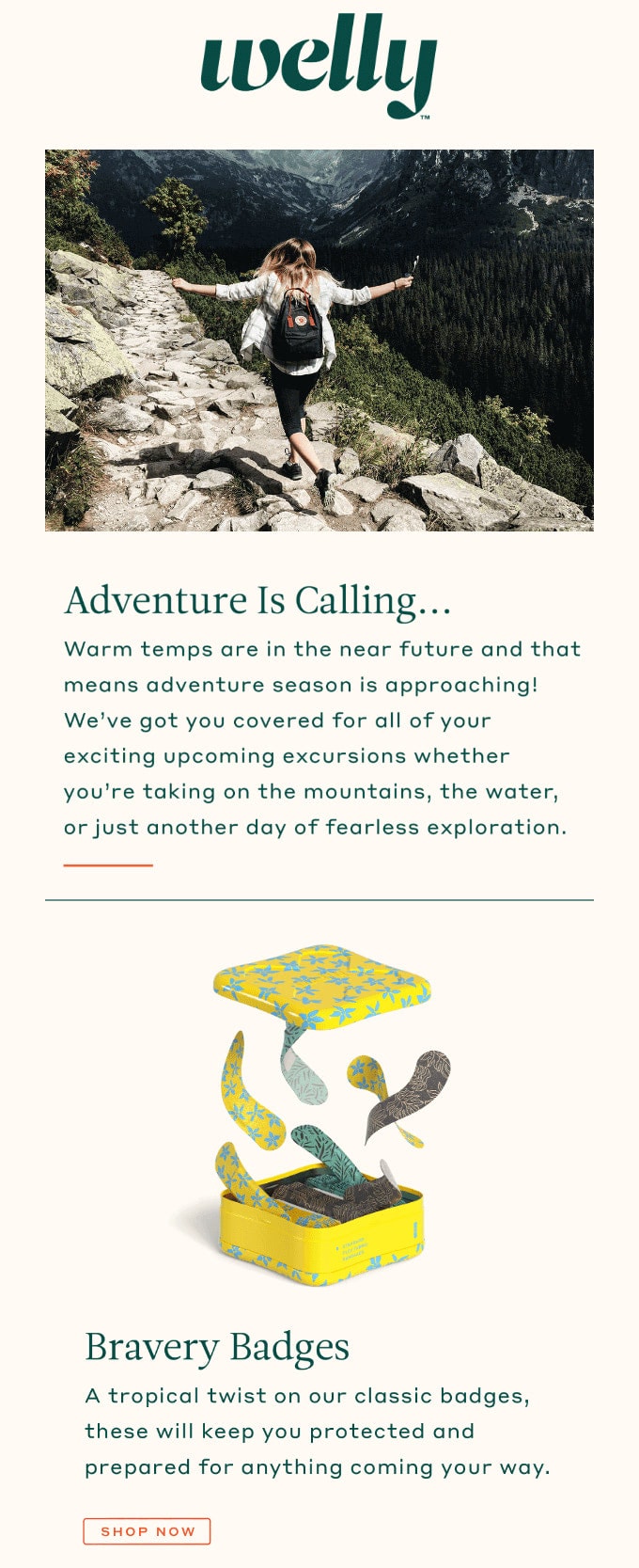
Welly’s email features a picture with beautiful scenery where the woman enjoys herself. Only one person, but it appeals to our hearts. Is it not? We are in the same position. It has that magnetic vibe that is hard to resist to all nature-lovers. Note how the products are promoted. They are called “Bravery Badges” and “Waterproof Bravery Badges.” These words make the product fit the theme and look like a reliable tool in these uncertain times.
The newsletter from Rapha goes a bit further. It already starts with the subject line that goes perfectly with the current situation. “We may be riding solo, but never alone” is an email pitch that instantly catches an eye in the inbox. It is so relevant and so motivational.
Again, we can see a picture of a standalone hero right from the bat. However, as the subject line states, it does not feel lonely. On the contrary, the company creates the feeling that their product a reliable partner for all your bike adventures.
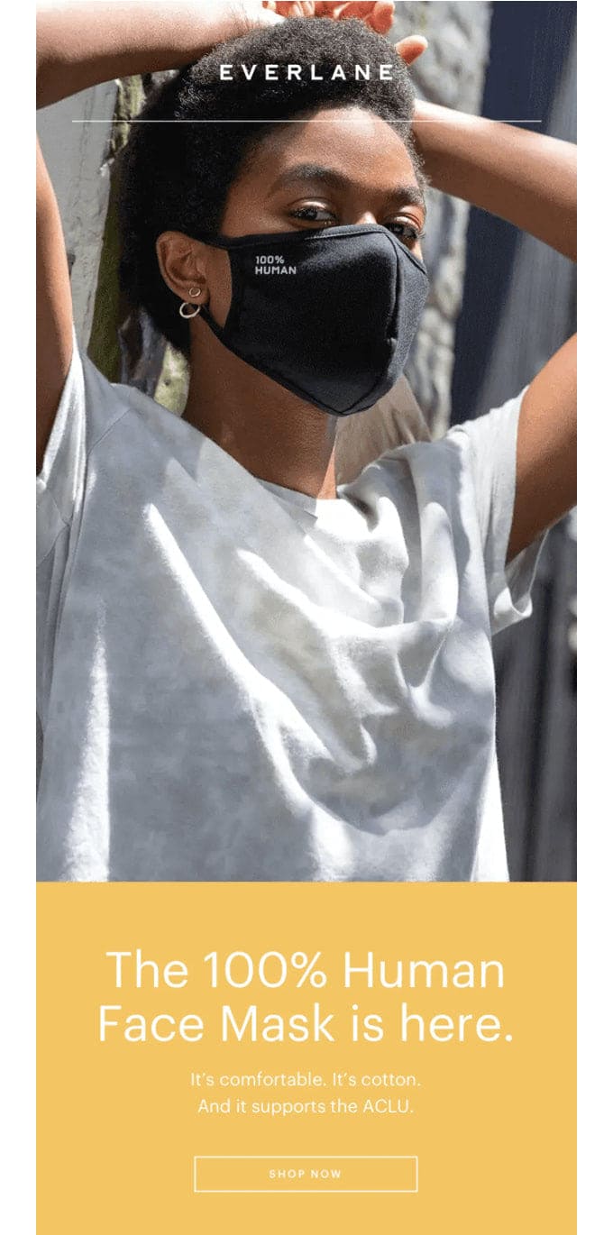
Another trend is using photos of people in masks. Although entrepreneurs do not exploit this trend to the full extent, let’s be honest, we all are sick and tired of hiding our beautiful smiles. Nevertheless, people in masks are everywhere; it is kind of our life now. Therefore, if you want to make your email design look up-to-date, using photos of people in masks is the right way to do this. However, do not overdo, since this trend feels to be imposed. Therefore, it can ricochet off. Consider Everlane that shows how to benefit from this tendency.
Everlane is a fashion brand that has added masks to their range of products, much like all others in this sector. The email marketing team uses a traditional promo newsletter for that. Here you can see a clever image, to be more precise, an animated gif that cycles through three shots that demonstrate how the product perfectly blends into today’s realm and fits both genders.
Obviously, Everlane is representative of the retailer sector. However, other brands also use this trend to make their point clearer. For example, Airbnb employs an illustration of a woman in a mask in one of its emails to remind the owners that it is vital to ensure all the safety measures were implemented.
People Illustrations
Human illustrations are gaining popularity. The deal is, the only way to show people without masks and stay in line with rules is to use human illustrations. Besides, illustrations always were in favor. They can take any aesthetics and experience to the next level by adding a warm artistic touch.
Another advantage of using illustrations is cost. It is much more cost-effective to use high-quality and meaningful graphics rather than arrange the entire photoshoot. In 2021 when the aftermath of the pandemic reaches its peak, forcing companies to cut expenses drastically, low-cost solutions can become a real lifesaver that will help your brand keep moving forward.
When using human illustrations, remember about another big tendency, inclusivity. Pictures with imperfections rule. Also, adopt some surreal drawings that provide food for thought.
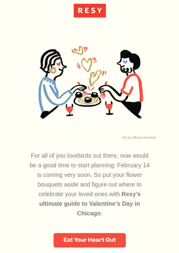
Consider an email newsletter from Resy that is dedicated to St. Valentine’s Day. Entitled “Where to Spend Valentine’s Day,” it features a beautiful illustration of a couple that enjoys a lovely dinner. Not only does this trick set everyone into the festive mood and reinforce the atmosphere of this beloved event, but it also supports the restaurant community with an appropriate visual. Clever.
Automation
To inch closer to the 1-to-1 marketing paradigm that is considered our future, you need to do a tremendous amount of work. It is labor-intensive: you need to analyze the statistics, do thorough segmentation, find the best timing, stick to perfect frequency, and create hyper-personalized content. The bigger the subscription list you have, the more challenging it will be to bring about the best result. It is here where automation joins the game and saves the situation.
According to Epsilon, automated emails enjoy 119% higher click rates than broadcast emails. Those who take email marketing seriously have already enjoyed its powers. All the transactional emails like Welcome emails, abandoned cart emails, onboarding emails, birthday emails, etc., are sent automatically. However, that’s not enough. Automation should be holistically integrated throughout the customer journey to give the user a sense of control over their inbox all the time. It helps to bring value that generates leads.
Another tendency that involves automation implies stepping away from manual campaigning and using AI. Behavior-based email automation is a solution to everything, yet it can only be achieved with the help of AI. Although it sounds bold and daring, yet technologies are getting better each year, this future is not too remote.
Even though AI-powered automation is still in its infancy, you can already enjoy the powers of automation.
- Choose a CRM system to know what is happening along sales pipelines.
- Master analytics tools available in your ESP.
- Make a plan and follow it not to miss a thing.
Finally, delegate email designing to professional HTML email template generators like Postcards. It is a time-saving and cost-effective solution that will help to build modern, fully responsive, and accessible email newsletters within minutes. If you are not planning to add full-time email staff this year, then it is simply irreplaceable.
Conclusion
A global pandemic has stirred things up and made some drastic changes in our lifestyle. To stay afloat next year and face the tough competition, we should embrace these changes and pull out all the stops.
When it comes to email marketing, it is here where you need to be on top of things. Follow the email marketing trends and email design trends to make the most out of these uncertain times and raise cash even in the worst-case scenarios in 2021.
