Fedora Workstation 34 is scheduled for release towards the end of April. Among the various changes that it will contain is the soon-to-be-released GNOME 40. This comes with a number of improvements and new features, most notably an updated Activities Overview design. Read on to hear the background behind those changes, and what to expect from the upcoming release!
What’s in a number?
In case anyone is wondering: yes, GNOME is changing its version schema for the upcoming release. The previous GNOME version schema gave stable releases even point numbers, like 3.32, 3.34 and 3.36. The last GNOME stable release is 3.38.
As the number of releases in the GNOME 3.x series increased, this approach has become unwieldy. It is therefore being replaced with a simpler schema where stable releases have their own major number. 40 will be followed by 41, 42, 43, and so on.
The new schema is starting at 40 because the next release will be GNOME’s 40th. This means that, going forward, the GNOME version number will indicate the number of stable releases that GNOME has produced.
While it might seem like a coincidence, the GNOME 40 version number is incidental to the overview design changes described here.
Why change the overview?
Okay, back to the Activities Overview! Before I talk about the changes themselves, I wanted to briefly touch on the motivations behind them.
One of these is that the overview hasn’t received much in the way of design updates since its introduction in 2011. Other aspects of the desktop have evolved (notifications, system status, unlock and login, to name some examples) but the overview hasn’t had much in the way of improvements.
Not only did the overview need a refresh, but a number of limitations in its design had become apparent over the years. The GNOME design and development team wanted to resolve these.
These limitations included the somewhat unhelpful blank boot state, the lack of coherent touchpad gestures, a sub-par app browsing experience, and the ambiguous nature of some overview elements, in particular the workspace switcher.
The goals for the upcoming release were, therefore, to give the overview a welcome refresh and address some longstanding issues, while keeping the basic design and essential features intact.
Design and development process
The new designs have been in the works for some time, with original conversations going back to around 2017. More recently, as the design has taken shape, a good deal of user research has taken place. These included exploratory interviews, a survey, user testing, and a diary study. These research exercises have fed into ongoing design work, helping to ensure that the design is attractive to both new and existing users.
There has also been an intensive testing program over the past month. VM images and a Copr were made available so that people can try the new design for themselves.
Those who are interested in this work can check out the research post on the GNOME Shell development blog.
Introducing the new overview
So what are the design changes? Most aspects of the GNOME desktop remain the same in Fedora 34. The top bar, search, notifications, shortcuts, system status are all largely unchanged. What has changed is the layout of the activities overview. As part of this, workspaces have switched orientation from vertical to horizontal.
This is what the initial overview looks like in the upcoming Fedora 34 beta:
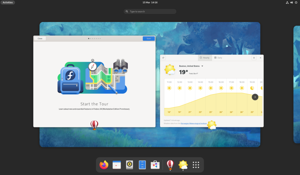
As before, search is central and at the top. Next there are the workspaces. These are arranged as a horizontal strip which can be panned left and right. Finally, there’s the dash at the bottom, which contains launchers for favorite and running apps.
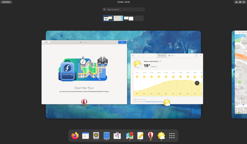
When more workspaces are in use, a small “navigator” appears above the main workspace strip. This allows switching between workspaces (by clicking the small thumbnail). It is also a drop target when dragging windows out of the main workspace view.
The second major part of the overview is the app grid. As before, access is via the grid button.
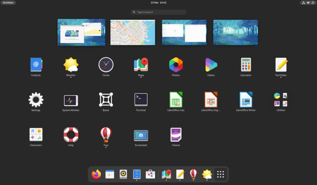
This is fairly similar to the previous version, though there are a few differences. First, workspace thumbnails appear above the app grid. These make it possible to see which workspace you are currently on, which is useful when launching apps. The second difference is improvements around app grid customization, including better drag and drop.
Check it out
The updated overview design will provide a refreshed look and feel to the desktop, some general improvements, and some new features. The new layout is better organized and easier to understand, the app grid is more customizable, and new gestures makes it easy to navigate the system with a touchpad. The boot state now also shows the overview by default, making it easier to get started.
There is also a collection of smaller improvements, including a better-organized dash, app icons that are shown over each window, and new shortcuts.
The new overview is a great reason to give Fedora 34 beta a spin and help out with testing. You can try a development version in a VM, either by upgrading from F33 or by installing a nightly compose. There’s also going to be test days running from 17-19 March, where we’re looking for volunteers to put the new design through its tracks.
Learn more
If you have more questions about the updated overview design, the GNOME Shell development blog contains a whole series of posts with information about the design and development process, as well as how the new design works.
