Building website layouts is a complex task. When the web was introduced we don’t have any specific methods, only tables that were initiated later on.
After a few years came divs along with some other HTML tags and tools that can help you build decent boxy website layouts. Then, as technology progressed, the idea of responsive website design was introduced hence frontend frameworks were inveterate.
One of the most popular front-end frameworks to build powerful yet awesome web layouts is Bootstrap. Bootstrap has always been the in-demand potent framework for developing responsive projects. Bootstrap offers a responsive, mobile-first fluid grid system that adequately scales up to 12 columns as the screen or viewport size increases. It’s jam-packed with predefined classes for easy layout creation, as well as useful mixins for generating semantic and fluid layouts.
With Bootstrap 5 recently released, there are few additional classes that we’re added related to the layout system. The following is a guide to the fundamental concept of the new version of Bootstrap, particularly the grid system.
The Bootstrap 5 Layout Grid System
With so many efforts for a virtual grid foundation, there hasn’t been any success even with the use of tables which made scaling impossible especially for smaller viewports due to its horizontal range inflexibility. When divs were introduced, it became possible using CSS to provide a grid-like system which then became the basic basis of every CSS frameworks including Bootstrap.
Bootstrap is like a canvas by default with a horizontal grid on a web page where elements are being placed within a particular viewport control as screen size increases. In order to use the basic grid system of Bootstrap, you must use the right doctype using HTML5 along with the viewing area settings via meta viewport.
Online Email Template Builder
With Postcards you can create and edit email templates online without any coding skills! Includes more than 100 components to help you create custom emails templates faster than ever before.
Try FreeOther Products
See code below.
<!DOCTYPE html>
<html lang="en"> <head> <meta name="viewport" content="width=device-width, initial-scale=1" /> </head> ....
</html>
Using the responsive meta viewport tag above simply means that the browser will render the width of the webpage with the size of the viewport where the webpage is currently being viewed. Just a note that you must not use this meta tag if you are not sure if your website was designed for responsive design or not. The result might be unpredictable.
Containers
Bootstrap uses container elements as the basis for its grid system. Containers can be used several times, but should not be nested. There are three types of container class that you can use: .container, .container-fluid and responsive container. The .container class provides a centered responsive pixel grid layout while the .container-fluid provides a full-width layout across all viewport sizes. The responsive container simply generates a responsive container which is width: 100% until the specified breakpoint. The maximum width of the container will change on different viewports based on the container’s semantic width breakpoint (e.g .container-*).
The table below shows each container’s max-width when you choose to use any of the predefined container classes.

Let’s see how each container class works on different screen resolutions or viewport sizes. Below, we have a basic markup for each container class.
<div class="container">.container</div>
<div class="container-fluid">.container-fluid</div>
<div class="container-sm">.container-sm</div>
<div class="container-md">.container-md</div>
<div class="container-lg">.container-lg</div>
<div class="container-xl">.container-xl</div>
<div class="container-xxl">.container-xxl</div>
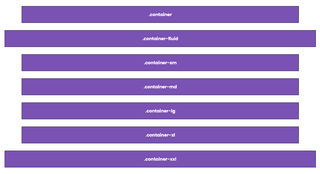
The containers above should look like this on double extra-large screen resolution:
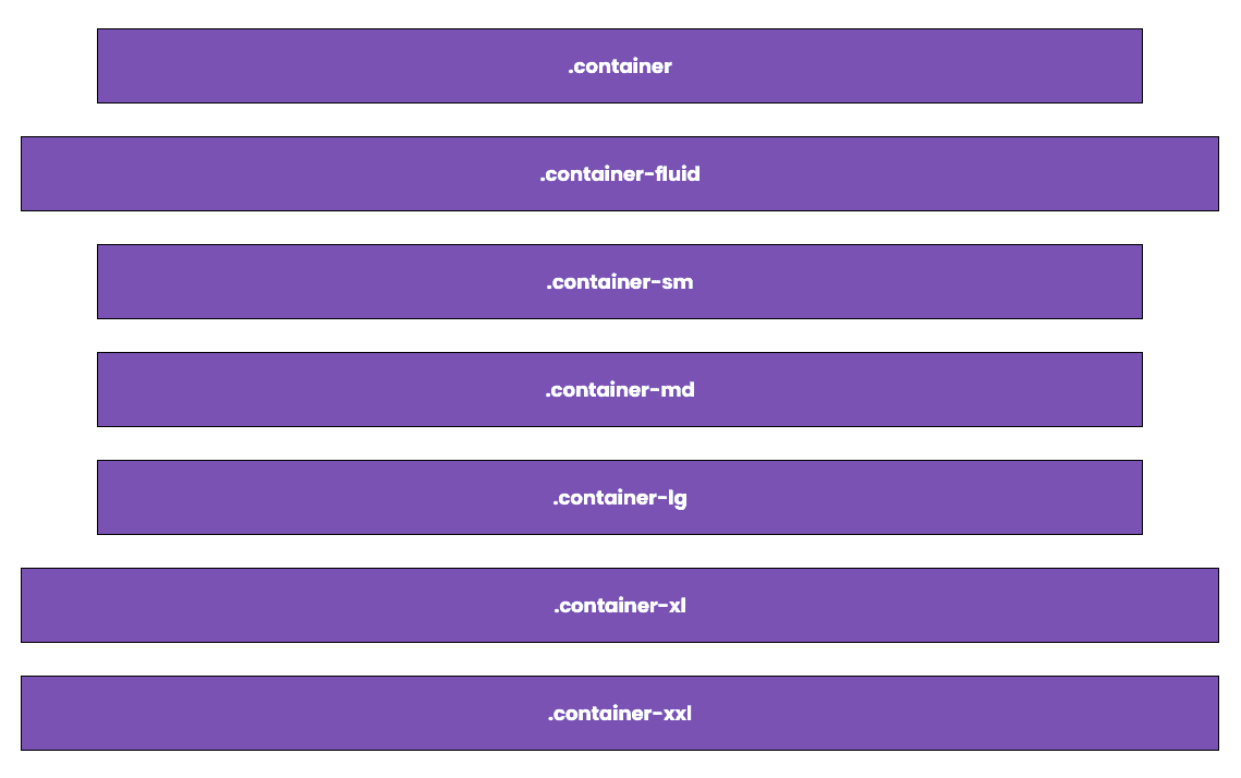
And this is how it should look like on extra-large screen resolution:
This is how it should look like on large screen resolution:
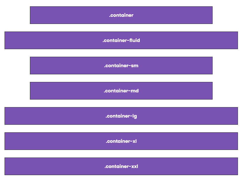
Here’s on medium screen resolution or tablet devices:
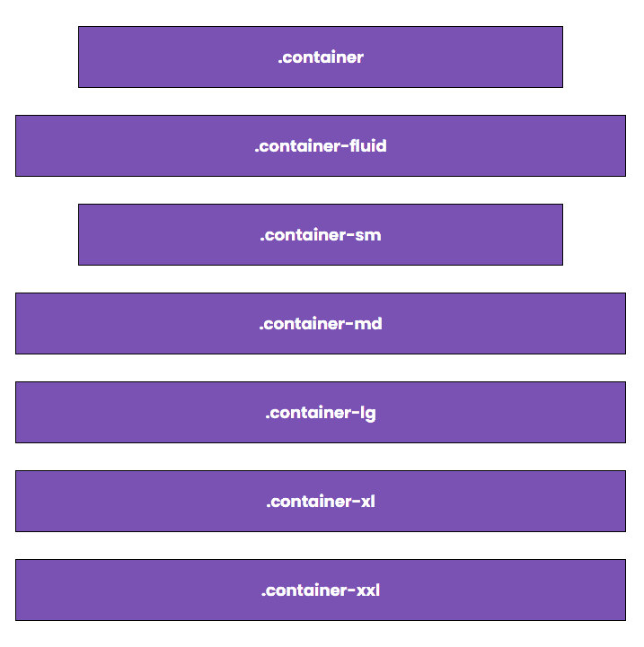
Finally, this how it should look like on smaller screen resolution or mobile devices:
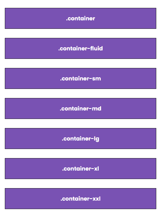
Rows
In order to use the Bootstrap grid system, you need to insert at least a single row of columns. Each container class can have one or more rows nested inside of it. A bootstrap row is simply a group of horizontal Bootstrap columns that can be broken into 12 parts.
Before we talk about columns, let’s look at the markup for rows.
<div class="container"> <div class="row"> <!-- insert column code here --> </div>
</div>
The code above simply creates one row but you can have as many rows within a container as you like. Rows can be reused as many times as you like on a single web page. Here’s how you would code a three-row layout:
<div class="container"> <div class="row"> <!-- insert column code here --> </div> <div class="row"> <!-- insert column code here --> </div> <div class="row"> <!-- insert column code here --> </div>
</div>
Columns
Bootstrap consists of a six-column class at your disposal which can adapt across all six default breakpoints. Let’s go over the fine points of each column class in Bootstrap 5.
- Extra small (xs) column class for targeting mobile devices that has a max-width of 575 pixels.
- Small (sm) column class for targeting devices with a resolution greater than or equal to 576 pixels but smaller than 768 pixels.
- Medium (md) column class for targeting devices that are greater than or equal to 768 pixels but smaller than 992 pixels.
- Large (lg) column class for targeting devices that are larger than equal to 992 pixels but smaller than 1200 pixels.
- Extra large (xl) column class for targeting devices that are larger than equal to 1200 pixels but smaller than 1140 pixels.
- Extra extra large (xxl) column class option is for all resolutions greater than or equal to 1400 pixels.
As stated above, each of these classes has its unique class prefix and modifiers. The width of the spacing between columns or gutter is 1.5rem (.75rem on the left and right).
The table below shows the widths of the dimensions of the columns.
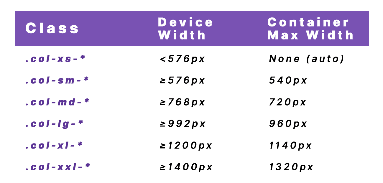
As an example, let’s create a simple responsive three-column layout. Here’s what your markup should look like:
<div class="container"> <div class="row"> <div class="col-md-4"> Column 1 </div> <div class="col-md -4"> Column 2 </div> <div class="col-md -4"> Column 3 </div> </div>
</div>
As seen in the markup above, we used three divs inside the .row class div, each contains the .col-md-4 class. For devices that have a resolution greater than and equal to 768 pixels and smaller than 992 pixels, you’ll see the three-column layout like this:

As the screen resolution decreases until it reaches a resolution smaller than 768 pixels, each column’s width would change to 100% and each column would be stacked on top of the other. With this state, you’ll see the three-column layout like this:
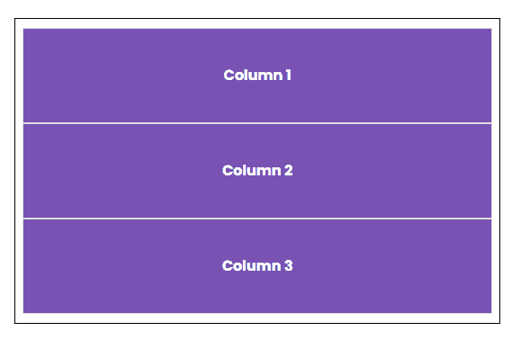
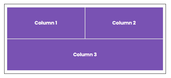
Next, let’s see how we can mix column classes for different screen resolutions. Let’s consider the three-column layout from above. We want the first and second columns to sit next to each other and have 50% of width each when the screen resolution decreases to less than 768 pixels. Then, the third column should stretch to 100% width and must sit below the first two columns.
In order to do this layout, we’ll mix some different column classes. Here’s what the markup should look like:
<div class="container"> <div class="row"> <div class="col-md-4 col-sm-6"> Column 1 </div> <div class="col-md-4 col-sm-6"> Column 2 </div> <div class="col-md-4 col-sm-12"> Column 3 </div> </div>
</div>
Notice that we’ve added the .col-sm-6 class to the first and second column divs. When the screen resolution is greater than or equal to 576 pixels but smaller than 768 pixels it will set the first two columns into 50% width each and the third column will span to 100% width layout with the use of .col-sm-12.
The result should look like this on small device/viewport:
Responsive Columns
If you want to have a column that has the same size from smallest to the largest device/viewport, you can use the .col or.col-* class. This means that no matter how you increase or decrease the screen resolution, the size of each column will remain the same according to your defined column size.
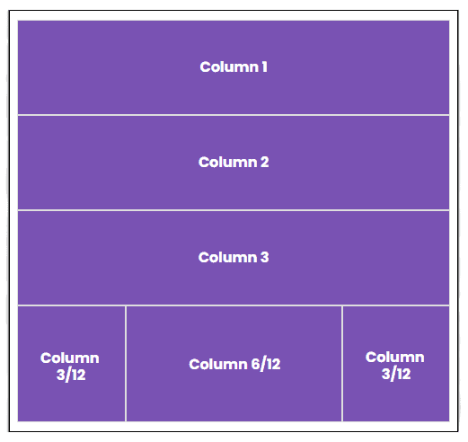
Let’s have an example on this one. Let’s create a two rows layout. The first row will have three columns, each will have a .col class while the second row will have three columns with .col-3, .col-6 and .col-3 classes in order.
Here’s what the markup should look like:
<div class="container"> <div class="row"> <div class="col">Column 1</div> <div class="col">Column 2</div> <div class="col">Column 3</div> </div> <div class="row"> <div class="col-3">Column 3/12</div> <div class="col-6">Column 6/12</div> <div class="col-3">Column 3/12</div> </div>
</div>
The result should look like this:

Additionally, you can also create stacked to horizontal columns using .col-* class. The “*” represents the viewport size which can be either xs, sm, md, lg, xl, xxl. This will make each column collapse and stack to horizontal view when it reaches the defined screen resolution or viewport size.
As an example, let’s go back to our previous example and modify the first three column divs from .col class to .col-sm. This will simply collapse and stack at the top of each column when the screen resolution is less than 768 pixels.
The markup should look like this:
<div class="container"> <div class="row"> <div class="col-sm">Column 1</div> <div class="col-sm">Column 2</div> <div class="col-sm">Column 3</div> </div> <div class="row"> <div class="col-3">Column 3/12</div> <div class="col-6">Column 6/12</div> <div class="col-3">Column 3/12</div> </div>
</div>
If the screen resolution is greater than or equal to 768 pixels, the result should look like this:

Then, if you decrease the size of the screen up to screen resolution smaller than 768 pixels, the columns should look like this:
Row Columns
Bootstrap also gives you the ability to rapidly set the number of columns to render each content using .row-cols-* class. This will simply create basic grid layouts or control content layouts.
As an example, let’s create a two rows layout with six equal-size columns. In order to do this, we need to add .row-cols-3 class inside the usual .row class div and then create a six-column div class with .col class on each one of them.
Here’s what the markup should look like:
<div class="container"> <div class="row row-cols-3"> <div class="col">Column 1</div> <div class="col">Column 2</div> <div class="col">Column 3</div> <div class="col">Column 4</div> <div class="col">Column 5</div> <div class="col">Column 6</div> </div>
</div>
The result should look like this:

As you can see above, using the .row.cols-3 class distributed three columns each on two rows.
Offset Columns
Perhaps your layout requires you to offset some columns and have some horizontal blank space before or after your element. Bootstrap 5 offers two ways to do this. First by using the responsive .offset-*-* (the first “*” stands again for the base widths of the media queries and the second “*” is the number of columns to offset) grid classes and the second is by using margin utilities such as .ms-auto to force sibling columns away from one another.
Let’s see how .offset-*-* class works first. Here’s what our markup should look like:
<div class="container"> <div class="row"> <div class="col-md-4">.col-md-4</div> <div class="col-md-4 offset-md-4">.col-md-4 .offset-md-4</div> </div> <div class="row"> <div class="col-md-3 offset-md-3">.col-md-3 .offset-md-3</div> <div class="col-md-3 offset-md-3">.col-md-3 .offset-md-3</div> </div>
</div>
As seen on the markup above, we used .offset-md-4 class on the second column of the first .row class div. This will give a blank space of four columns to the left side of the grid before the last four columns. In the same way, we added .offset-md-3 to each of the divs of the second .row class div so this will give three blank spaces each to the left of the grid accordingly.
The result should like this:

Next, let’s see how to achieve the same thing using margin utilities. Here’s what our markup should look like:
<div class="container"> <div class="row"> <div class="col-md-4">.col-md-4</div> <div class="col-md-4 ms-auto">.col-md-4 .ms-auto</div> </div> <div class="row"> <div class="col-md-3 ms-md-auto">.col-md-3 .ms-md-auto</div> <div class="col-md-3 ms-md-auto">.col-md-3 .ms-md-auto</div> </div>
</div>
On the first row above, we used .ms-auto class on the second div column. The letter “m” from .ms-auto stands for margin, while the letter “s” is used for setting margin-left and margin-right. The word “auto” means we are setting the margin to auto which will pull the .col-md-4 to the end of the grid.
For the second row, we use .ms-md-auto class. Again, the letter “m” stands for margin, while the letter “s” is used for setting margin-left and margin-right. The letters “md” stands for the breakpoint where the column will set to 100% max-width, in this case, medium viewport or medium screen resolution. You can change this to whatever breakpoint you prefer according to your layout’s needs. You can also visit the margin utilities page to learn more about spacing options.
The resulting layout will look like this:

Gutters
Bootstrap 5 provides predefined gutter classes for adding padding between your columns which is principally used to responsively space and align content. Gutters are gaps between column content that can be responsively adjusted and are specifically built by horizontal padding.
There are few classes to remember when it comes to using bootstrap gutters:
- .gx-* class is used mainly to control the horizontal gutter widths.
- .gy-* class is used mainly to control the vertical gutter widths.
- .g-* class is used mainly to control both the horizontal and vertical gutter widths.
- .g-0 class removes the predefined grid classes including negative margins from .row class and horizontal padding from related columns.
Let’s take a closer look at each one of these gutter classes by setting some examples.
<div class="container"> <div class="row gx-5"> <div class="col"> <div class="p-3 border">Horizontal Gutter</div> </div> <div class="col"> <div class="p-3 border">Horizontal Gutter</div> </div> <div class="col"> <div class="p-3 border">Horizontal Gutter</div> </div> </div>
</div>
<div class="container"> <div class="row gy-5"> <div class="col-6"> <div class="p-3 border">Vertical Gutter</div> </div> <div class="col-6"> <div class="p-3 border">Vertical Gutter</div> </div> <div class="col-6"> <div class="p-3 border">Vertical Gutter</div> </div> <div class="col-6"> <div class="p-3 border">Vertical Gutter</div> </div> </div>
</div>
<div class="container"> <div class="row g-3"> <div class="col-6"> <div class="p-3 border">V & H Gutter</div> </div> <div class="col-6"> <div class="p-3 border">V & H Gutter</div> </div> <div class="col-6"> <div class="p-3 border">V & H Gutter</div> </div> <div class="col-6"> <div class="p-3 border">V & H Gutter</div> </div> </div>
</div>
<div class="container "> <div class="row g-0"> <div class="col-3"> <div class="p-3 border">No Gutter</div> </div> <div class="col-9"> <div class="p-3 border">No Gutter</div> </div> </div>
</div>
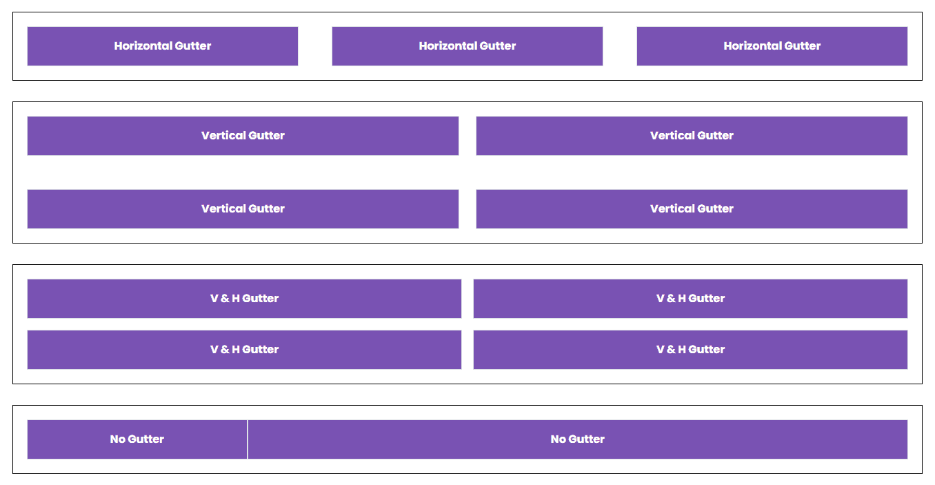
To understand the markup above, let’s go over the fine points of each div class in details:
- The first container represents the horizontal gutter. As you can see inside the .row class div of the first container we added .gx-5 class to add spaces between each column which controls the horizontal gutter width. The smaller number you put inside the .gx-* class, the less space or horizontal gutter width would be.
- The second container represents the vertical gutter. Inside the .row class div of the second container, we added the class .gy-5 which will add space between each column in a vertical manner. Just like the horizontal gutter, the less number you put inside the .gy-* class, the less space or vertical gutter width it would be.
- The third container represents both the horizontal and vertical gutter. By using .g-3 class inside the .row class div, we are basically adding space on both horizontal and vertical gutter width accordingly.
- There are two ways to set an offset on columns in bootstrap: first is through the .offset-*-* class and through margin utilities.
- The last container represents the zero gutter width which basically removes predefined grid classes related to gutter via .g-0 class added along with .row class div.
- In order to avoid unwanted overflow on larger gutters, you can use matching padding utility class such as .px-* class or use .overflow-hidden class along with the .container class div as a wrapper solution.
Let’s see how this looks like in the browser:
Grid in a Nutshell
The main concept of any Bootstrap website is the layout or grid component. The Bootstrap grid system consists of 12 equal-width columns. Using its built-in predefined classes, you create columns and span a number of columns at a time. Alternatively, you can use rows inside columns to add new variation column widths.
The following are helpful points to know when it comes to working with grid layout:
- Each (.row) must be in a container (.container, .container-fluid or responsive container).
- Each row may be used horizontally to place multiple elements together.
- Each column must be placed inside rows. You can place additional rows inside one row to have more controlled column widths.
- If a specific element needs columns that can be positioned within a row and exceed the element limit of twelve columns, the whole collection will be wrapped.
- You can use .col class if you want to have grids with the same size from smallest to largest screen resolution.
- You can also quickly set the number of columns to render to each using .row-cols-* This will simply create basic grid layouts or control content layouts.
- If you want to have a horizontal stack grid, you can use .col-*-* class where in the first “*” is the breakpoint where you want your grids to stack and last “*” for the column count (e.g .col-sm-5).
- Column gutters are predefined by default which starts at 1.5 rem (24 px) wide but can be responsively adjusted through .gy-*, .gx-*, .g-* and .g-0.
That concludes the basics of the Bootstrap 5 grid that you’ll need to know. We did not discuss flexbox or other helpful utilities here; it makes more sense to create a separate tutorial to avoid dubiety with the raw grid system.
Bootstrap’s grid is a powerful and fully responsive grid system designed for a wide range of uses and compatible with many devices and screen resolutions. Setting up your own layout is easy with basic knowledge.
For more information on the Bootstrap grid, please refer to the official documentation here.


