Waiting is an annoying thing, whether it happens on a website, mobile application, or in real life. Not only does it frustrate people, but it also leads to some unpleasant consequences.
According to recent studies, 1 in 4 visitors will abandon a website if it takes more than 4 seconds to wait, almost 50% of users do not revisit websites that make them waiting and every second of delay reduces customer satisfaction by nearly 16%.
In a word, the longer a webpage takes to load, the more its bounce rate will increase and the fewer customers you will onboard. This small delay makes a huge difference and becomes an obstacle in your path to success. Speed is crucial.
To make matters worse, we can’t avoid loading time. With all the extravagant solutions and marvelous user experiences, we need this time for proper prep up.
However, it does not mean we should suffer the consequences of this delay. You do not have to be a UX professional to turn the tables around and make the most out of this irritating flaw. There is a simple, tiny and time-proven solution that usually comes as an afterthought, though it should be highly prioritized. This solution is to use a preloader.
We have ceased to notice that majority of components that need a little time in order to fully load or perform can be a time-consuming action accompanied by small, pleasant indicators that visualize the process. You can stumble upon these tiny assistants everywhere — apps in cellphones or tablets, personal websites, online services are highly populated with such animated control elements that try to make the user experience more pleasant and more enjoyable.
Online Email Template Builder
With Postcards you can create and edit email templates online without any coding skills! Includes more than 100 components to help you create custom emails templates faster than ever before.
Try FreeOther Products
Usually, it is a simple throbber that for a long time was a gif animation, and only recently has become a code-based solution that involves the utilization of either JS or/and CSS, thereby opening up almost endless possibilities to developers.
Though the form the spinner takes varies, they all have one thing in common: They do not show exactly how much time you need to wait, they are basic, wordless indicators. If you want to achieve the greatest output, you should do something with their appearance, namely, you need to give the loading animation an impressive, attention-grabbing and spellbinding look. And if you want to come up with something worthy and interesting that will seize users’ attention for a while, we are here to help you by offering a collection of free loading animations and spinners created by skilled web developers. You can use them as an inspiration or as a starting point.
What Is a Preloader?
Preloader is a system status UI element. It can be increasingly primitive like a traditional throbber, or complex like a sterling loading animation or even splash screen.
As a rule, a preloader is used at the starter point of the website. However, it can also be seen after the form was submitted or when a slider, image gallery, or video player is waiting for the content to be fully loaded.
What Does Loading Animation Do?
Initially, a preloader was created to inform users that the “loading” is in process. As Jakob Nielsen, who holds 79 United States patents on ways of making the Web easier to use, mentioned in 1993, it has three significant advantages:
- it reassures the user that everything is fine with the software.
- it indicates approximately how long the user needs to wait.
- it provides the user with something to look at.
These three advantages form the basis of modern preloaders. Today every loading animation does everything it can to make these advantages their own.

Gmail Loading Animation
Why Is It Important to Add Preloader to Your Website?
It is vital to add a preloader to the website simply because people get bored when they wait for a fully prepared platform.
The sad truth is, our technologies are not perfect. Reasons for delay can be different, for example, weak internet connection, bad website server processing, a high number of instant visitors, long operation processing, malfunction of scripts or typefaces, etc. Sometimes we can’t control this.
However, what we can control is those seconds of delay. Our task is to ensure that this forced waiting does not cause confusion, irritation, and annoyance. The only way out is to capitalize on preloader. It saves our website from losing precious customers.
That’s not all; the modern loading animations can pursue other goals as well. For example, you can use them to
- promote brand;
- set proper expectations;
- drum up interest;
- maintain interest;
- enliven interface;
- add personality to your product;
- give instructions on how to use a website;
- entertain users and cheer them up.
A thoughtful preloader can easily make the waiting process more bearable and even productive for both sides. It improves the usability of the interface and ensures a positive user experience
What Does Make a Good Preloader?
Many things we deem good practices for preloader is hard to describe. First and foremost, it should reduce frustration and avoid annoyance at all costs. But how to achieve this? Consider these 11 essential things that may help in this matter.
- Show an approximate time to wait. It can be represented in exact numbers or percentage indication.
- Update the loading status. How much work is done? What is the actual progress? You do not have to write a treatise here; several straight-to-the-point notifications will be enough.
- Give a reason to wait. Explain to viewers what’s happening under the hood. Stress out why it is important. On top of that, you can list tasks that are in progress. For example, “calculating”, “data processing”, etc. This clarifies that the program hasn’t crashed and gives users a valid reason to wait.
- Keep the user’s eyes busy. Use dynamic effects or animations to set the scene in motion and force users to stare at the screen.
- Make the perception of waiting time fly by. The mental time will pass faster if the user is engaged. Therefore, exercise your creativity. Though you do not have to test your limits, even a simple trick of using catchy or daring colors can do the job.
- Make the delay experience consistent with your brand. This can set the right expectations or serve as a preamble for your service or product.
- If you are forced to use an indeterminate preloader, make sure you explain why loading takes time. Also, the infinite loading animation may sweeten this delay and distract attention for a while.
- Reserve a prominent spot for the preloader. Do not make your visitors seek it on the screen. This may only increase frustration.
- Focus on progress instead of wait times. Sometimes it is better to reduce the amount of time visitors can see preloader and instead create a sense that information is incrementally displayed on the screen using a skeleton screen.
- Do not show preloader if the loading time is less than 1 second. 1 second is a reasonable amount of time that any visitor can wait.
- Always provide feedback if loading takes more than 3 seconds of delay.
Last but not least. Optimize your website and make it as fast as possible. Please do bear in mind that people do not like to wait. Even if you have an ingenious loading animation, still add more than two of them to your website, and you will end up with annoyed and frustrated users who believe that they deal with an excessive amount of waiting around for pages, even though that is not true. Therefore, focus on speed and optimization and use loading animation only when it is necessary.

Download Process Animation by Oleksandr Pronskyi
Types of Preloaders
Even such a tiny component of the user interface that appears only for several seconds and usually can be seen at the beginning of the user’s journey on your website comes in all shapes and sizes.
Preloaders boast of a variety of solutions. After all, they play a critical role in creating the first impression that we never have a second chance to make. Therefore, sometimes they can be real masterpieces.
Generally speaking, preloaders can be split into two groups: determinate and indeterminate. However, that’s not all. Depending on their shape and style, preloaders can be broken into several large groups.
Let’s dive a bit deeper into loading animations and find out the most popular types we have these days.
The first one on our list is a progress bar.
Progress Bars
As the nameplate states, the progress bar is a linear indicator. As a rule, it is determinate. It shows users how much time is left via graphical representation by animating an indicator along the length of a fixed, usually horizontal track. Many brands adopt this type of preloader: Android, Gmail, Instagram, etc.
Usually, they are used as a part of some complex loading animations that can be on-brand, informative, or entertaining.
Note, sometimes progress bars can be indeterminate. In this case, they are pure decorative units whose aim is to entertain users and keep their interest alive since they show an uncertain amount of wait time. The great thing is, even without a percentage indicator the user has a feeling of the uploading progress.

Progress by Oleg Frolov
Basic Throbbers or Spinners
Throbber, also known as a “spinning wheel,” is one of the first preloaders on the Web. It is dated back to the 1990s, and it seems that it is familiar to every user on the internet, which is a big bonus.
Throbber has a round shape, consisting of several part-radial lines or discs arranged in a circle. Much like the progress bar, it can be determinate or indeterminate. Traditionally, throbbers are indeterminate. They only show that loading is in progress and provide users with an animation to look at.
However, modern throbbers can be seen with numerical indicators that show the percentage or amount of seconds which visitors have to wait.

Preloader by Bret Kurtz
Custom Loading Indicators
This is by far one of the largest categories. Custom loading animations boast of the sheer diversity of design and ideas. It is here where artists are limited only by their imagination. They use various traditional effects such as pulsating, rolling, sliding, fading, etc.
Custom loading animations can be primitive or vice versa complex and sophisticated. They can be determinate or indeterminate. Their key difference is that they can be composed of anything you can imagine: graphics, typography, images, and even 3D objects and renderings.
As a rule, custom loading animations are created to have three advantages formed by Jakob Nielsen and pursue some real marketing goals. For example, they promote the brand, increase credibility in the company, set expectations for the product, and ignite interest.
The most popular custom loading animations are
- Text-based Loading Animations,
- Morphing Loading Animations,
- Sci-fi Loading Animations,
- Abstract Loading Animations,
- Meaningful Loading Animations,
- Logotype-based Loading Animations.

Preloader by Emanuel Panarello
On-Brand Splash Screens
Technically speaking, the splash screen is not a preloader. It is a launch or boot screen that appears when the website is ready. However, over recent years, we could witness the combination of splash screen and preloader. This powerful duet creates the illusion of short page load times, strengthens brand identity, and even offers a practical advantage. More so, it makes the first impression last longer.
Although it takes extra time, effort, and resources, if you are up to some strong start or dramatic entrance for your product, it should be your top choice.

Splash page by Timothy Giblin
Trends in Preloaders and Loading Animated Spinners
On-brand Loading Animations
One of the biggest trends in this area is, of course, on-brand loading animations. As we have just mentioned, preloaders are an excellent opportunity to make the first impression count and reinforce the brand identity. More and more companies use it as a tool for laying a solid foundation for advocating the brand. Even individual artists and startups join this mainstream.
On-brand loading animations come in all shapes and sizes. Some of them feature the name of the company, while others focus on products or services. Some of them are pretty simple, while others are sophisticated.
Consider the personal portfolio of a talented senior art director from France, Sonia Presne. Here the preloader features only the name of the artist and some tiny charming dynamic effects. However, it is made with chic and elegance that perfectly supports the overall image.
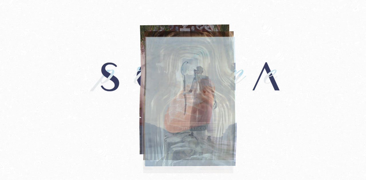
That’s not all; here, the preloader nicely flows into a skeleton screen that reveals the homepage, drumming up interest right from the get-go. As a result, the first seconds on the website – even forced to be spent on waiting – bring benefits to the brand.
3D Scenes and Surreal Compositions
For quite a long time, 3D scenes were considered to be the new frontier for effective websites. Along with abstract compositions and geometric artworks, they ruled the roost. Today this tendency sees a decline in popularity; however, it is still highly in demand when making the first impression.
The great thing is, even the smallest 3D scene can make any visitor stare at the screen in awe. It easily brightens up seconds of waiting. They are eye-catchers and attention magnets that can pursue various goals, from preparing the ground for marketing tricks to just leaving a long-lasting impression.
Consider Digital Lookbook of China-based brand as a perfect case in point. Much like the website populated with abstract shapes and 3D scenes that give the front page a surreal feeling, the loading screen can also boast such a personality and charisma. It greets the audience with a ball of intersected glowing tubes and text that is set in motion.
This solution is pursuing several goals.
- First of all, it grabs overall attention easing frustration caused by delay.
- Second, it sets the right expectations.
- Third, it promotes the brand.
- Finally, it adds creativity to the project, ensuring a good first impression.

Last but not least, it is important to note that such kind of solutions is source-consuming. Sometimes they can be too heavy for a loading animation that, by default, should be lightweight and fast. Therefore, always exercise caution when you want to use them as preloaders.
Text-based Loading Animations
Text-based loading animations never get old. They are timeless. If you want to make preloader look modern, but you do not know what trendy these days is, you can never go wrong with animated typography. It is just a feast for the eyes that entertains and grabs attention and provides users with something to read, thereby keeping visitors occupied for several seconds.
The great thing about this kind of preloader is that people easily fall for them since we are accustomed to seeing text in loading animations. However, unlike the basic preloaders, where text plays only a supporting role by notifying users about how much time is left, here it is the star of the show.
Text is very flexible in terms of various manipulations. Using basic CSS and JavaScript, along with numerous custom typefaces, you can create inspiring solutions.
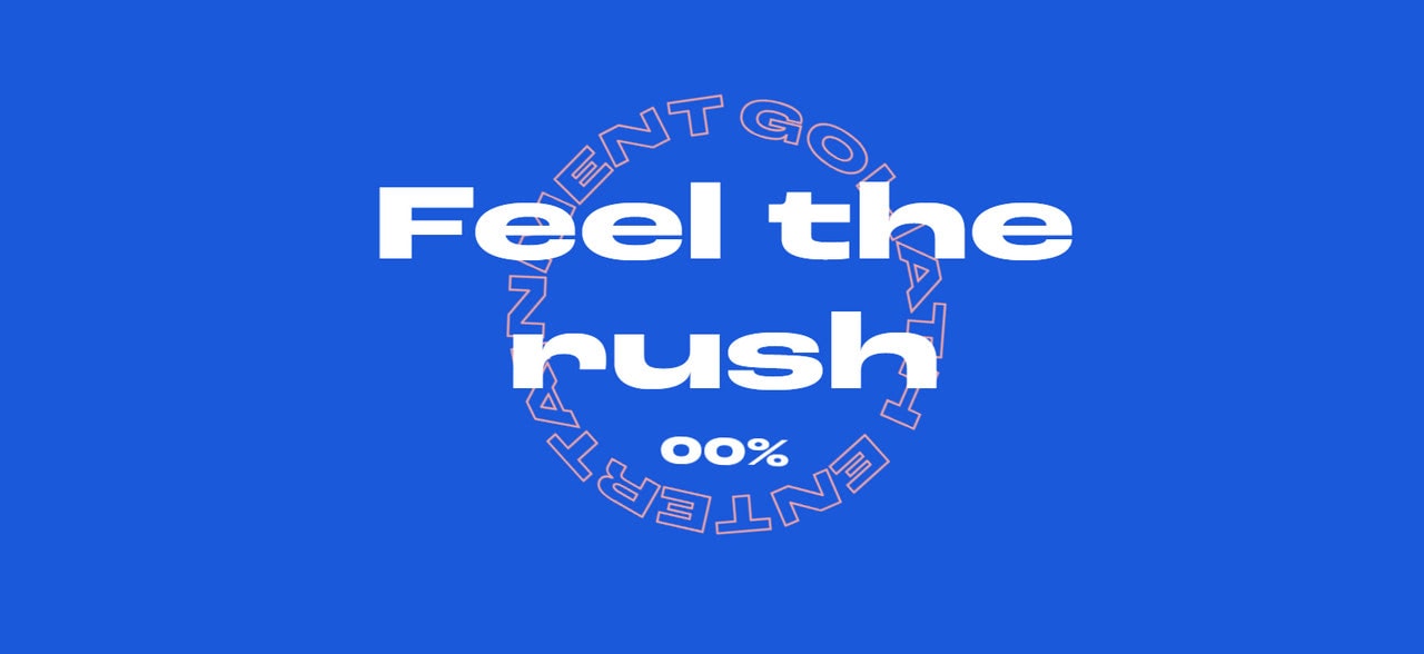
Goliath Entertainment is a typical example. The team has played a pretty simple trick in terms of design and realization. Nevertheless, it draws our attention and brightens up seconds of waiting. More so, it is even a bit hypnotic. Therefore, it goes perfectly well with the overall aesthetics serving as a perfect starting point. Clever.
Solutions for Free Preloaders
There are numerous ways of creating a decent preloader. For example, designers could do loading spinners in Photoshop or Sketch, web developers could use the help of CSS, HTML, and JavaScript, whereas non-tech-savvy people can easily benefit from various tools that do all the heavy lifting for them.
Let’s focus on the latter option that gives regular users and tech artists a chance to improve their web estate with some pre-made high-quality loading animations.
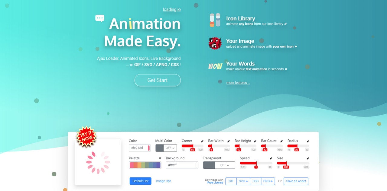
Loading
Loading, perhaps, is one of the most popular solutions for free preloaders on the Web. It has been with us for ages, so it certainly has a seal of approval.
It comes with numerous features. It has an icon library, spinner gallery, theme icons, seamless repeatable patterns, progress bars, Ajax Loader, animated Icons, and live backgrounds. Everything is available in GIF, SVG, APNG, and CSS formats.
That’s not all; it also lets you create animations from images or text and customize icons from the library right in the playground.
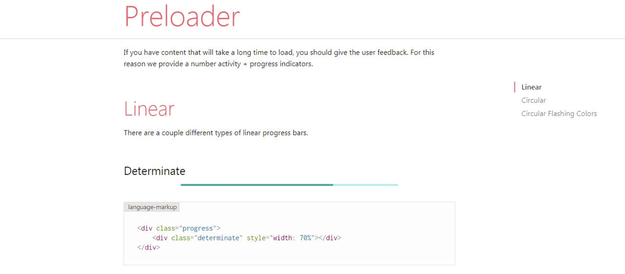
Preloader by Materialize CSS
Materialize is a framework made with Material Design principles in mind. It ships with various components, but one that we are after is free preloaders. Like a design system created by Google, the preloaders by Materialize CSS help build high-quality digital experiences.
They are neat, clean, subtle, and elegant. Although they do not have an extravagant appearance or attention-grabbing behavior, they are enough to make the website intuitive and beautiful and give the user feedback.
Here you can find two types of free preloaders: linear (determinate and indeterminate) and circular. Although you do not have much choice, this is still enough for interfaces with sleek and elegant aesthetics.
Lottie Files
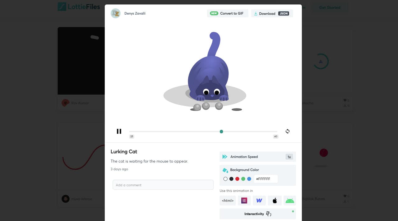
Lottie Files is a vast collection of free preloaders available for personal and commercial use. There are more than 140 pages of options. You can find simple spinners and creative loading animations. Some of them are vibrant, while others are gloomy. There are even hilarious options much like this amusing cat featured below.
The great thing is, each variant can be customized via an intuitive interface where you can set such parameters as speed, background color, interactivity, and layer colors. The result is compatible with regular websites, Webflow-powered websites, Android and iOS applications.
Free Preloaders on Dribbble
Last but not least.
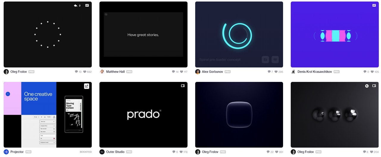
Dribbble can become a great source of infinite loading animations perfect for situations when the waiting time is indeterminate. Here you can find some exceptional free preloaders available in GIF format that can win over your visitors with beautiful designs and ingenious ideas.
There are options for every taste: some of them are serious, while others are hilarious. Some of them are pretty lame, while others give your audience food for thoughts making the time pass quickly.
Collection of Free Preloaders and Loading Animated Spinners
Armed with all the basics and tips, it is time to explore some real-life free preloader examples to get inspiration, gather some cues on how it should be done, and find a perfect solution for your next project.

Free Preloader Example by Crianbluff
This simple yet exquisite and refined loading animation created by a Colombia-based artist will delight you with its flawless performance. Thanks to its brilliant appearance and neutral aesthetics, it fits websites from various niches.
Here you can see a combination of traditional circular preloader and text-based loading animation where the latter is a determinate indicator. This combo diverts attention from the delay and, at the same time, focuses users on the text. On top of that, it is responsive and pretty lightweight.
That’s not all; the loader finishes with a charming transition effect that makes the homepage entrance memorable.
Free Preloader Examples from Osadcha
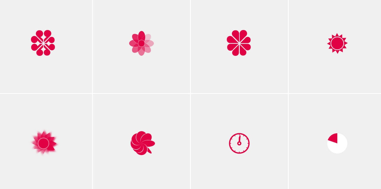
Marina Osadcha, a gifted artist from Ukraine, has shared with the community a collection of 24 sleek and neat preloaders made with pure CSS3. Although the artist sticks to a relatively simple design, but this primitivity makes these free preloaders useful for various projects since they can easily blend into any environment.
You can find some exciting options like jumping balls, bouncing squares, and folding squares. There are also versions with morphing, rotating, and 3D moving.
Last but not least, Marina has also created some fantastic text-based preloader examples. On her Loaders 2 codepen, you can find six different options where your company’s name or just the simple word “Loading” can become a star of the show that promotes the brand and makes waiting entertaining and informative. This time, the developer has used a duet of CSS3 and JavaScript to give objects some nice effects.

Foot Tap Loading Animation by Darin
Let’s make things a bit exciting with this adorable free preloader by New York-based artist. Darin is famous for his hilarious code projects. His Yeti 404 Page made a lot of fuss several years ago. This one is no exception. It is pure joy.
Although this loading animation can’t boast of lots of actions or dynamic effects, nevertheless it is enough to keep the user’s attention for several seconds. More so, it is also enough to lighten the mood and brighten up the seconds of waiting.
It is just a small illustration brought to life with the help of GreenSock and SVG. However, the idea is ingenious. As we all know, everything creative is precisely what the doctor ordered when you need to kill waiting time.
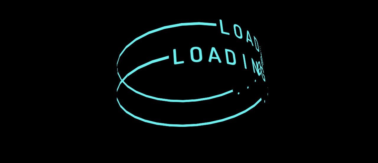
Text Ring Loading Animation by Jon Kantner
From warm human touch to some cold digital environment, look at this marvelous free preloader example that radiates a techy vibe on all fronts. Text Ring Loading Animation by Jon Kantner is a small digital masterpiece that makes the first impression count.
The idea is pretty simple: there is the text, obviously “Loading,” written around the edge of two spinning rings. However, what makes it worthy of your attention is 3D realization and beautiful neon coloring that reminds Tron-like entourage. Also, the spinning is brilliant. As a result, you can’t take your eyes off it.

Perspective Sphere Free Preloader by Jon Kantner
This is another masterpiece created by Jon Kantner. We could not help but include it since it reflects the modern tendencies in the website’s loading animations. His free preloader example is a pure 3D composition that will delight you with its energetic nature and skillfully realized perspective. Again, some Tron vibe here that gives the design a stylish techy appeal.
Basically, it is just four spheres that move forward and backward. The depth of field effect is mesmerizing.
The great thing is, everything is made with pure CSS. It is lightweight and fast, even though its WebGL-inspired feel may suggest otherwise.
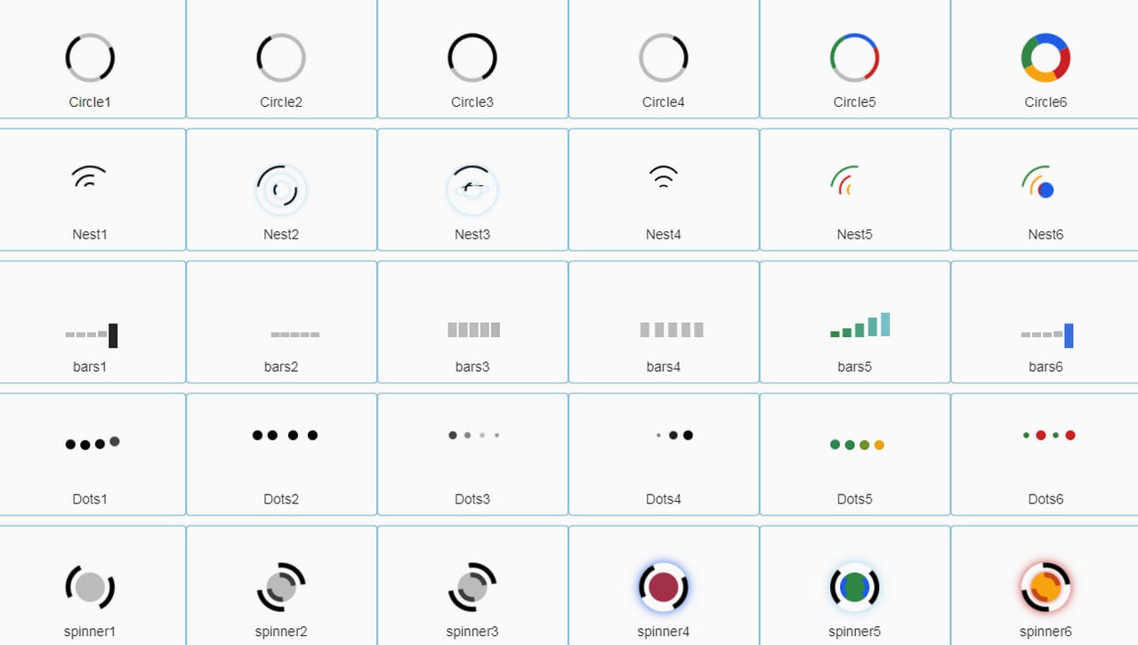
50+ Pure CSS3 Free Preloaders by Sahar Ali Raza
If you are in search of a quick but reliable solution that will brighten up several seconds of delay and does not need to be determinate, you can give a shot to one of the free preloader examples made by Sahar Ali Raza.
This talented Pakistan-based developer has created a whole set of small yet vibrant and eye-catching loading animations. You can find in here compositions made of circles, squares, and rings. Some of them are rotating; others are vibrating, sliding, and even flipping. There are also some custom versions based on icons that were made to be festive.
Everything is made with pure CSS, so you do not have to worry about JavaScript loading time.

Free Preloader by Nazar Kubaty
This one may scare you, but it will undoubtedly give your users food for thoughts, leaving them guessing whether the website is fine or not. This guessing game will be enough to distract attention from the loading process, making the time fly by.
Nazar Kubaty has come up with a fantastic idea: even though the glitchy effect is a bit controversial, but it can still be exploited to benefit the project. The loading animation has a decent tech vibe that, when appropriately implemented, may easily give your website an extra spice.

Rocket Loading Screen by Kilian Maret
Illustrated approaches always grab attention. Much like Foot tap loader by Darin, this one also catches an eye. It gets its beauty from an ingenious idea.
The loading animation is based on a simple illustration of a rocket. Set in proper surroundings and accompanied by some clever dynamic effects, it creates a feeling of lightning speed, making us believe that this delay will be over soon. Brilliant.
More Preloaders and Loading Animated Spinners
Spin
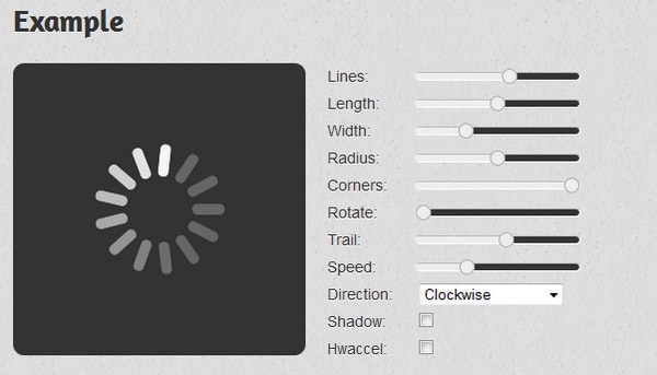
Spin is a simple, jQuery-based generator that is aimed to provide you with a basic spinner animation. The service lets you customize the throbber by setting such parameters as:
- Speed
- Direction
- Radius
- Length, width, corners
Single Element CSS Spinners
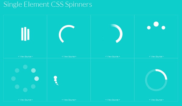
The developer gets the most out of new CSS3 features, particularly animation features, and shares with online audience a whole range of elegant, properly-executed spinners that can be easily incorporated into your dynamic projects by simply inserting a piece of code.
Spinners
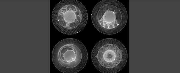
Based on a CoffeeScript and Saas, this mesmerizing and truly original animation will definitely become a centerpiece of your preloading page. It is well-suited for enigmatic projects, websites with maritime theme and military projects.
Spinner

Spinner has a lovely boxy feeling that goes well with formal, grid style websites or those that feature an evident blocky layout. The effect is accomplished only through new possibilities of HTML and CSS, so be prepared for some troubles with old versions of browsers.
CSS Spinner

An animation that features funny moving dots that eventually form one clear relatively huge circle will become an ideal match for any website with circular vibe. The author has created the spinner only using CSS and HTML, so you will be able to quickly set your color or change other parameters in styling file.
CSS Domino Loader

The spinner is based on a set of vibrant green rectangular domino-style tiles that are falling and rising again and again till the page or any other dynamic or content-intensive element fully loads. Driven by a standard and pleasant ease effect, it unobtrusively grabs users’ attention and entertains them for a while.
Bar/Ball Loader

This bright dynamic effect is very similar to the previous one. It also consists of a range of rectangular tiles that are set in motion by a small rotating ball. So that if you need a more colorful and dynamic variation of the previous effect, you can exploit this loader.
Cube Fold

The web developer takes advantage of advanced 3D transform properties presented in CSS3. The animation begins with a one small square that gradually transforms into a perspective view of a cube that ultimately shapes a regular hexahedron. It will naturally complement various gift e-stores, geometry style projects and websites dedicated to high-tech.
CSS Loading Boxes Animation

This set of four dynamic colorful boxes that circle will ideally fit into any vibrant flat website. By virtue of a single style sheet you will be able to change colors and set the speed for animation
Text Filling

This is an optimal solution for those who want to mark their preloading page with a title, text-based logotype, tagline or even catchy slogan. Your integral element of brand identity will be slowly but surely filled with a fancy water animation. As usual, effect is achieved through combination of HTML and CSS.
Yet Another Loading Animation
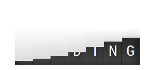
This is another loading animation that is aimed to prominently display text. However, you should take into account the fact that it won’t work properly on every browser, for example on internet explorer it will crash, since the effect is accomplished via new CSS3 features that are not supported there
Google-Inspired CSS Preloaders

Google’s official logotype has been a source for inspiration numerous times. Creatives exploit its neatness and brightness in various design purposes, yet it is time to use it in a web development. Matt Litherland has created a CSS-powered preloader based on vibrant Google coloring with a help of Mixin, basic ease animation and several transformations.
Reddit Loader

Don’t like Google-inspired loaders? How about animation that comes from Reddit? It certainly does not have such a vivid appearance, the animation is based on only two-tone scheme, yet it definitely has a high-tech, even a bit nuclear, charm that will be appropriate for various high-end projects.
Jellyfish Spinner

With just a little imagination and basic knowledge of new CSS3 features you can create really interesting and impressive loading animations. Mike Cobb presents a very peculiar solution that transforms a basic spinner into a bizarre jellyfish style animation.
Loader #7

Fabrizio Bianchi does not reinvent the wheel nor offers a unique solution; he only gives you an opportunity to populate your dynamic project with a basic circular spinner that has a truly refined and stylish appearance.
Another Simple CSS load animation

You can easily prettify a basic spinner by adding some extra effects with a help of CSS3 features thereby turning it into an eye-catching preloading animation, as Paul Sullivan has done. The animation is extremely beneficial in tandem with a circular logotype.
Loaders and Spinners
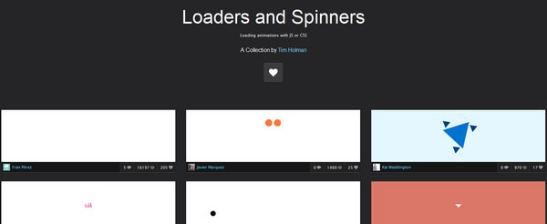
Tim Holman has a really rich collection of loaders and spinners. You will definitely find something special. There are amazing bright loaders, SVG loading images, purely CSS based preloaders and various rare and uncommon effects.
Conclusion
We have covered different solutions that are aimed at improving your projects, making a more comfortable place for users through the use of small, yet eye-catching and engaging, preloaders and loading animated spinners. Trends come and go, but the need to give UI feedback to users is still here.
Users expect a fast reaction. Studies show that even the smallest 4-second delay can have drastic outcomes. Most people won’t give your product a second chance if they need to wait a bit longer. They just go away and never come back. Therefore, providing clear, immediate feedback on users’ actions is crucial.
How to realize it? Simple; use a loading animation. A small and even primitive spinner that notifies users about the loading process and progress they have with an app or website saves the day. On top of that, it can become much more than: when well-done, it can easily accomplish some serious missions.


